Color Mixing 101
GUT Color Exploration, Part 2: Color Mixing w/ Visiting Artist Lena Wolff
Hellooooo Gut Friends.
I can’t believe how fantastic last weeks Personal Anatomy Drawings turned out. You can check out all the drawings GUT members made in our community chat. Common denominator amongst everyone? We all seem to have a pretty good sense of humor about ourselves. Thank goodness. Also, we are a pretty darn good-looking bunch, if I don’t say so myself. Mwah.
Now for something completely different.
As promised, this week our very own GUT color expert Lena Wolff is back with the next chapter of our deep dive into the fascinating (and often daunting) topic of Color. In part one, Lena helped us get to familiar our existing, at-the-ready colors through creating color charts. This week, we build on that assignment. Lena is teaching us about…
Color Wheels → the foundation of color mixing.
And without further ado, I pass the mic toVisiting Artist Lena Wolff!
“Hi everyone! It’s Lena. I’m happy to be back at GUT for our next color exercise, the Color Wheel, i.e the foundation of all color mixing. If you’re interested in going deeper, I have a few new color workshops coming up that you can check out! Now, let’s dive in…….
What is a color wheel?
Color wheels demonstrate the range of colors of the rainbow, also known as Prismatic Colors, that we are able to see as humans. (Unbelievably, other animals are able to see a whole realm of colors beyond our visible spectrum!) While the colors of the rainbow fall along a continuum (with blurred boundaries) the colors of the color wheel are segmented into 12 sections: 3 primary colors, 3 secondary colors, and 6 tertiary colors.
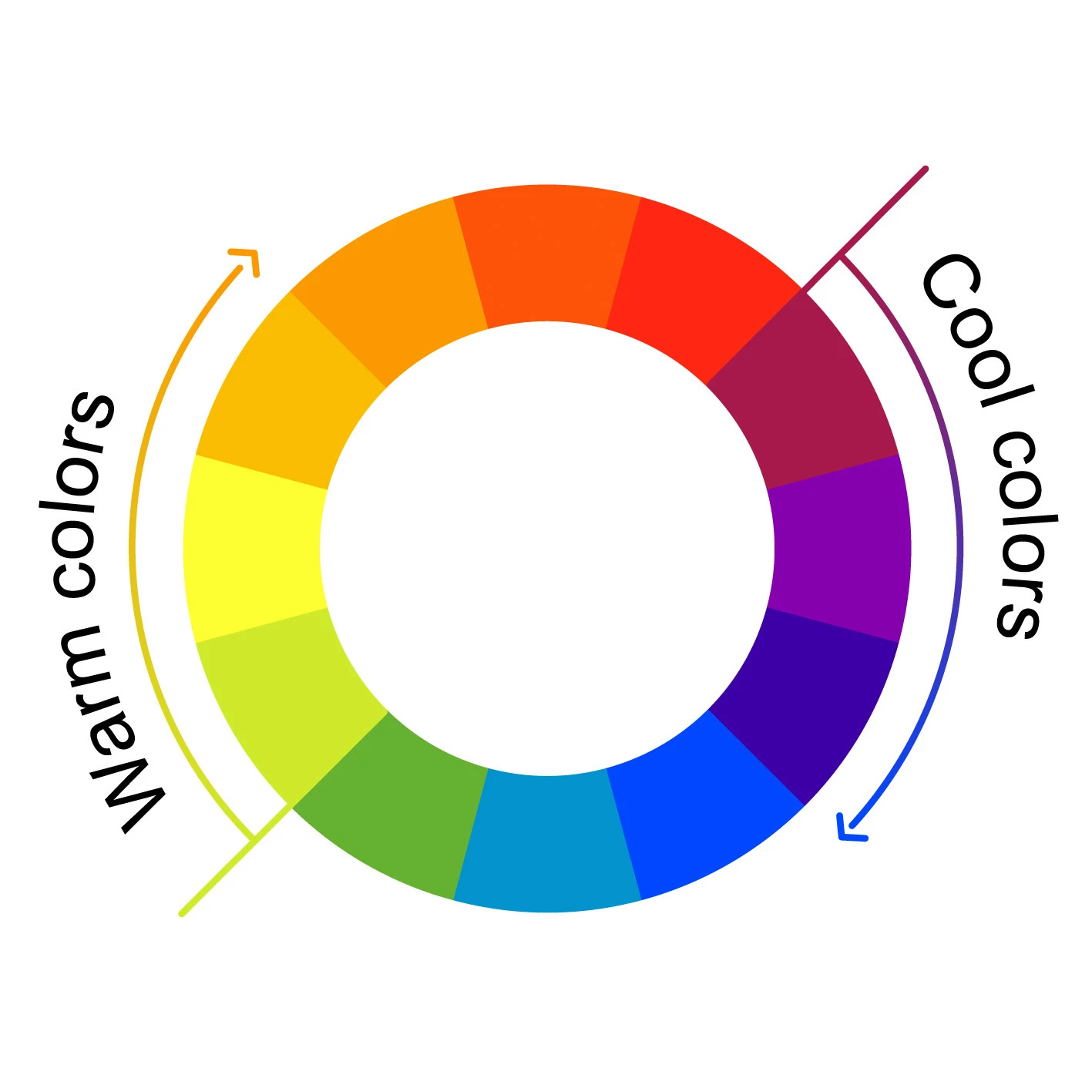
The elegance of the arrangement of the color wheel reveals fundamental “chromatic” relationships, with analogous colors situated side by side and complementary colors opposite to one another. The wheel is also organized around color temperature, with a warm range of colors from yellow to red-violet on the right and the cooler range of colors from yellow-green to violet on the left.
The miracle of the color wheel is that only 3 Primary Colors - Red (Magenta), Blue (Cyan) and Yellow - are needed to mix the full range of all 12 colors depicted!
Before we get into understanding the colors on the color wheel, here’s a little context…….
A brief history of the color wheel
In the mid 1600’s, Sir Isaac Newton conducted his famous prism experiments, often referred to as his, “celebrated phenomenon of colors.” Before this, bizarre speculation abounded about the nature of color and vision. For example, around 400 BC Plato was a leading proponent of Emission Theory, the idea that the human eye projects rays of light, like a flashlight beam, in order to see. This is, of course, the complete opposite of what’s actually going on!
Even two thousand years after Plato, during Newton’s time, the reciprocity between light, object and the human eye was deeply misunderstood.
Newton’s prism experiments revealed that objects in and of themselves are not “colored.” He demonstrated that a prism, when struck by sunlight, does not generate the colors of the rainbow in and of itself. Instead, the prism makes visible or reveals the full range of colors contained within sunlight that we are able to perceive as humans. Newton never came to fully understand the nature of light as wavelengths, but his work proved that our ability to see color is generated by light itself. In tandem with his experiments, Newton developed the first circular diagram of colors in 1666, published in his book Optiks in 1704.
Artists and designers have played around with color wheel variations ever since.
What’s the purpose of painting color wheels?
As someone who teaches color theory, I’ve found that the subject is best understood through experiential hands-on practice, instead of just talking about it. The color wheel is a visual example of the foundation of color mixing and it demonstrates important color relationships. When we paint color wheels, those color relationships begin to make sense.
Color Wheel Terminology.
It’s useful to communicate with a shared vocabulary when learning about color to better collectively understand what we’re actually talking about! Here are some of the basic terms related to the color wheel.
Primary Colors
The primary colors are Red (Magenta), Yellow, and Blue (Cyan). These colors are the foundation of color mixing. Together, these three colors present the strongest force of hue and intensity. They are indivisible, meaning they cannot be mixed and can only be found directly, right out of the tube (or pencil, etc). Conversely, all of the other colors in the color wheel can be mixed with a combination of two primary colors.
Note: “Red” isn’t reeeeally a primary color. Magenta is a more true primary and will generate more vivid saturated secondary colors (i.e violets and oranges) than red. You’ll see this when we do the exercise.
Secondary Colors
The secondary colors are created by mixing two primary colors together. The secondary colors are:
Orange - a mixture of red/magenta + yellow
Violet - a mixture of blue/cyan + red/magenta
Green - a mixture of blue/cyan + yellow)
Tertiary Colors
These are the intermediary secondary colors that lean toward one or another of the related primary colors. Their hue names are always hyphenated, as they are a combination of the color located on either side of them on the color wheel. On the color wheel image above, these are only visible in the outer ring.
Yellow-Orange
Red-Orange
Red-Violet
Blue-Violet
Blue-Green
Yellow-Green
Analogous Colors
Analogous colors are closely related hues situated side by side on the outer ring of the wheel. For example, blue and violet are analogous, etc. Pairings of analogous colors are often easy on the eyes.
Complementary Colors
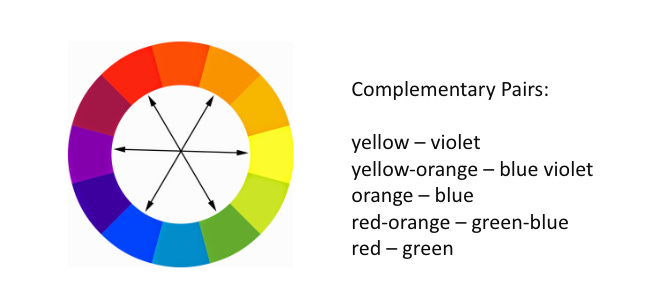
Complementary colors are found directly opposite to each other on the color wheel. Pairs of complements placed next to each other create a visually dynamic, electrifying effect. But when mixed together, complements generate highly desaturated colors, or neutrals, such as grays, browns, muted mauves and dull greens.
Color Temperature
Color temperature relates to the idea of colors appearing “warm” or “cool” and may generally be related to notions about the opposing phenomena of fire and ice. Generally, warm colors are seen on the right side of the wheel, yellow to red-violet, and cool colors are on the left, yellow-green to blue-violet.

All of this will begin to make sense as we paint the color wheel together! Let’s get into it!


