Let's Focus on the Negative
A Little Lesson on Negative Space featuring Hokusai, Du Bois, Schiele, and the Fed Ex logo.
Helllooooo GUT crew!
Well, we are officially in 2023. Thank goodness. I LOVED seeing everyone’s drawn More/Less lists. I included a random few at the end of this dispatch. If you haven’t made one yet, it’s not too late. The chat, and the year, will remain open. (Same with The GUT introductions - say hi if you’re new!)
Last week I asked you for a More/Less list for the GUT in 2023, too, and got some great feedback. A couple of you requested I highlight GUT members, and several asked for more “drawing basics.” Love these ideas, so check and check. Starting today with a return to the basics.
Today we’re doing a simple, transformative lesson/exercise on how we look at the world, what we see and don’t see, and how translate that experience to the paper (and our lives.) This week we’re focusing our attention on what isn’t there: Negative Space.
Negative Space
What is it and how does it work?

Negative Space, also called White Space1, is the area that surrounds a subject. (The subject is the Positive Space.) Imagine a classical European oil portrait of a silly looking person in front of a dark background. The subject is the person and the space around the person is the Negative Space.
When we first start drawing, many of us pay attention exclusively to the subject of a drawing or painting. But negative space is equally important in a drawing. And the more we draw, the more we start to notice it. And the more we notice it, the more we can use it to help our drawings do what we want them to do.
Negative Space performs many functions: it focuses our eyes on the subject, it keeps our eyes moving or still, it allows for visual space/room to breathe, and sometimes it gives the subject an extra layer of meaning. For example, have you seen this logo before?
Sure, you’ve probably seen it a million times. Have you ever noticed the hidden symbol in the logo? Focus your attention on the negative space of the logo - the space between the letters. Do you see it? If not, look between the E and the X. See the arrow?? YES. It’s subtle - took me YEARS to see it. But once you see it you can’t unsee it. In this case, the designer/ad guy used the negative space to create an image that informs the meaning of the subject. An arrow takes your package from here to there. Very clever, ad guy/designer.
In other cases, negative space can be used to tell a story about what’s NOT there. Historian and sociologist W.E.B Du Bois established the first school of sociology (!) at the historically Black college Atlanta University and collected data on the lives of African American in the late 1800’s. When he was just 30 years old, he was invited to exhibit his research at the 1900 Paris World Fair. His presentation became the foundation of modern data visualization, and are great examples of using positive/negative space to tell a visual story. Here is one example:

This bar chart tells us what jobs African Americans held in 1890. The Subject is the red lines. The subject tells us what jobs African Americans held at the time (agricultural, farmers, laborers, a few barbers.) The Negative Space is the space around the red lines and text. What does that tell us? It tells us all the jobs African Americans were kept out of (teachers, clergymen, printers, engineers.) When we look at the positive and negative space together, we see a story about how a huge disparity in distribution in power. By focusing on the positive AND the negative space, we are able to see a richer story. 2
This applies to visual art, too.
Spacial Elements in Drawing
First, a little primer. Composition is the way elements are arranged in space. That could be on a canvas, on a piece of paper, in a room, etc. In every composition there are three spacial elements: Positive Space (subjects), Negative Space (the space around the subjects), and The Frame (the boundaries of the paper/canvas/room you are working within.) Working with with those three elements you can do anything you want, but they will always always always be working in unison, and how you arrange them creates harmony, tension, focus, overwhelm, you name it. But you can never have one without the others.3 Let's look at some examples by some of my favorite aritsts.
Here’s an example of these three elements working in unison (with special attention paid to Negative Space) - a painting by Japanese artist Katsushika Hokusai.
Hokusai has removed everything except the man, the flower in its pot, and his signature (the subjects.) The quiet, grey space around the subjects is the Negative Space. By creating all this negative space, Hokusai pushes us to focus on the subjects. He also has arranged the positive and negative space within the frame to draw our eyes first to the man in the middle, then up to the flowers on the right, where our eyes rest and we gaze at the flowers. Just like the man in the painting. So simple and effective.
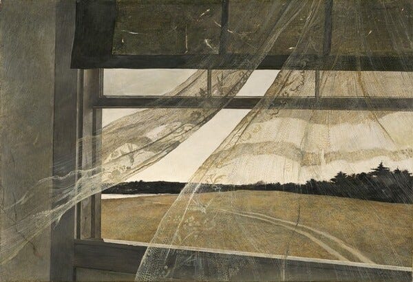
Okay, here’s another example:
This painting is by the American artist Andrew Wyeth. Like the arrow in the FedEx logo (I can’t believe I’m comparing Wyeth to FedEx!) the subject (the drapes) frame the negative space (the sky). The rectangular frame of the canvas contains the space and helps our eyes to move around. Notice how the diagonal shape of both the curtains and the negative space billow in strong contrast to the horizontal and perpendicular lines of the frame. Working together, these elements create an interesting composition that tells a story and communicates a mood.
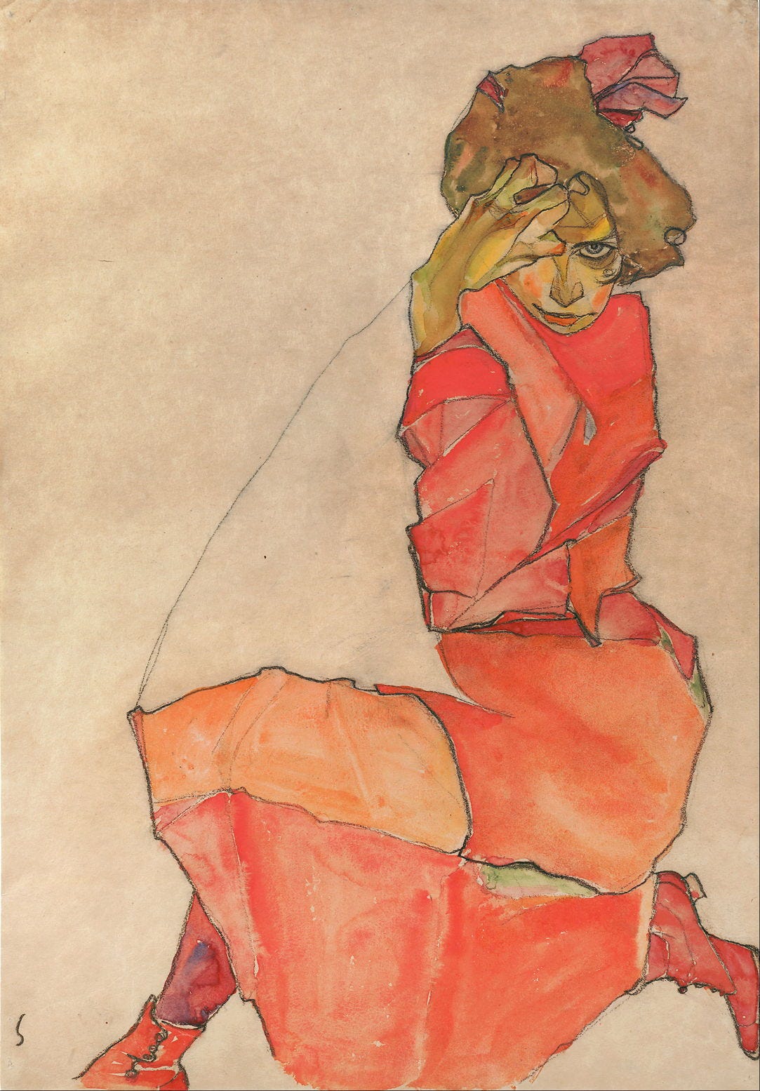
Alright. Last example is my favorite. One of my all time favorite artists since I was in high school: Egon Schiele. A Viennese painter whose life was cut short at the age of 28 by the Spanish Flu.
Gah, right?!? Look how Schiele uses the three elements of composition. Look at those negative shapes! Look how he arranged the subject to create the negative shapes at the bottom, how graphic and moody and striking it is! The Composition!! AHHHH I LOVE IT SO MUCH!!!! And yes I’m shrieking. Try and stop me.
Here’s another:
GAH. SO GOOD. An Austrian painter (b. 1890) Schiele studied under Klimt and is known for his drawings and paintings of people (esp nudes) and landscapes. His work is full of harsh angles and surprising shapes created using negative space. I think we can all learn so much about composition by looking closely at Schiele’s work.4
And with that, let’s practice what I’ve been preaching.
Let’s draw our Negative Space assignment:


