

Personal Color Palette
Drawing inspiration from our daily lives—and artists Alma Thomas & Bisa Butler.

Hello DT GUTsters!
Such fantastic faces you’ve all been drawing! We know the painful desire to “get it right” when it comes to faces, so it was all the more wonderful to see how you played with the assignments. Turns out we weren’t just working on drawing techniques—we were also letting go of unnecessary creative blocks!
All right, let’s dig into this week’s topic: COLOR! We’ll first hear from Wendy about her own up-and-down relationship with color. Then we’ll look at two artists who use color in bold, exciting ways.
Making a personal color palette
From Wendy:
You’ve heard me say it before: I struggle with color. It took me months to decide what color to paint my bedroom. After countless nights comparing color swatches and scrolling through Pinterest, I took the leap and ordered a glowing peach color called “Champagne Bonfire.”1 After a weekend of taping, priming and painting the walls, ceiling, and trim, that glowing peach color ended up looking more like the flesh of an electrified fish. I slept inside a champagne bonfire barf tank for weeks.
So yeah, I struggle with color. Ask me what goes well with a light blue and I am lost. But when I’m working on my own drawings and paintings, somehow I have color confidence. Why??
Unlike when I’m selecting a bedroom wall color, when I draw I never choose colors out of thin air.
Where does color inspiration come from?
Sure, there’s a field of study called “Color Theory” and gorgeous books filled with blocks of color. They explain, essentially, that color is not static, all color is relative, and we all see color differently. It’s fascinating! Does it help you choose “brick red” over “deep magenta,” though? Nope.
But what happens when you start with a moment or a memory? Or a feeling or an idea? Now you’ve got a foundation to build on! The colors Wendy uses in her drawings are always inspired by something she’s seen, often in daily life.

Sometimes it’s not that literal. When making the flavor wheels for Salt Fat Acid Heat, Wendy was inspired by the colors in Old Masters’ paintings that feature food connected to the chart’s subject. Specifically, for the “World of Acid,” she referenced Caravaggio’s Basket of Fruit.


Nerdy but true. Much like last week, when we talked about drawing faces, we’re not saying this is the right way to use colors. But it gives us one way to approach it.
Here are two more approaches from artists with colorful work!
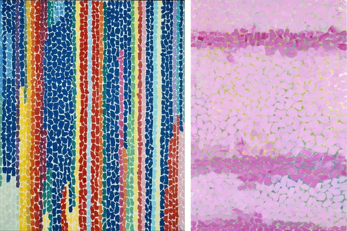
Alma Thomas
“Man’s highest inspirations come from nature. A world without color would seem dead. Color is life. Light is the mother of color. Light reveals to us the spirit and living soul of the world through colors.” - Alma Thomas
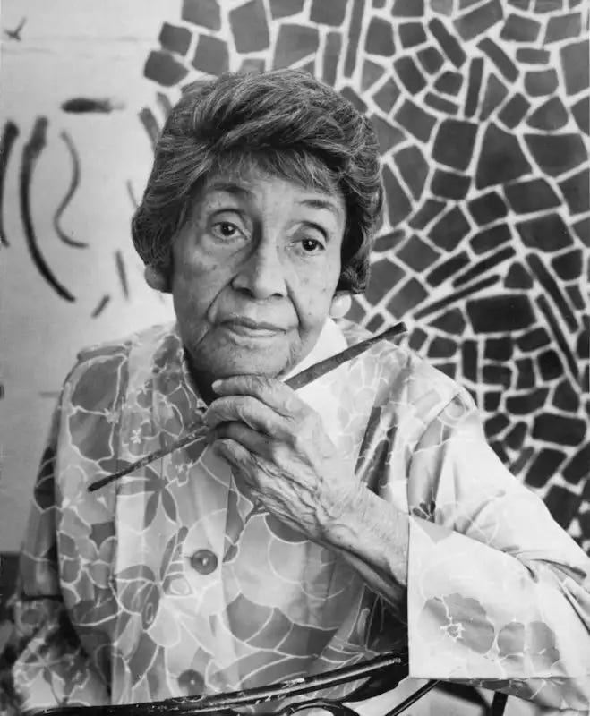
Painter and lifelong art teacher Alma Thomas’s work focused on color. Her color choices were inspired by the two things that excited her most: nature and the cosmos. The titles of the pieces below speak to her color choices. The colors speak to the feeling of her subjects.
Bisa Butler
“If I’m doing [a portrait of] somebody who is considered powerful or a leader, I might use a base of red [wool], and then all the colors that go on top of that are interacting with that red.” - Bisa Butler
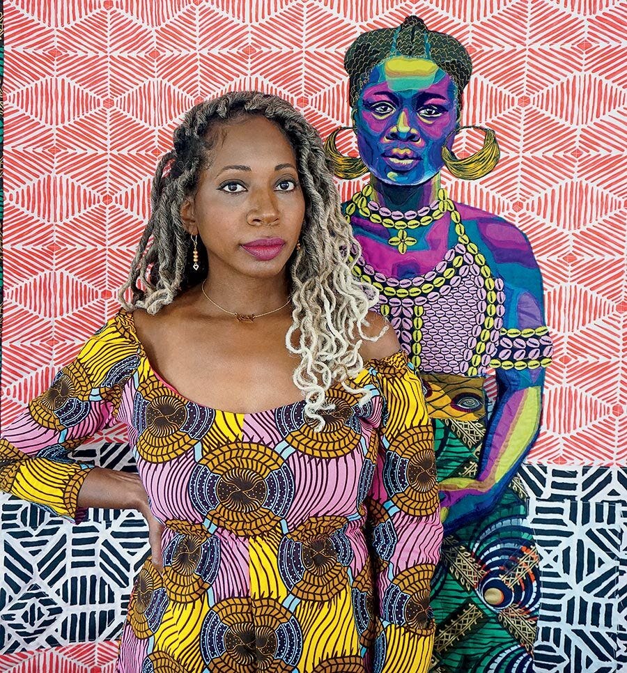
The colors in artist Bisa Butler’s life-sized quilt portraits of African Americans are strong, bold, and vibrant. She often works with bright, patterned fabrics popular in West Africa, and uses symbolism when she selects color, too.
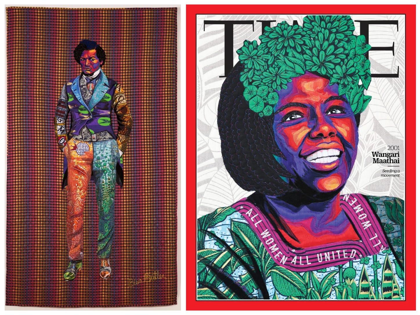
Click here to listen to the DrawTogether podcast episode about Bisa Butler’s work.
Both these artists pull from a mixture of reality, imagination, and reference to create an emotionally charged field of color. Their personal interests and experiences form unique color palettes that convey their feelings of joy, celebration, power, and reverence.
Now let’s create our own personal vocabulary of color.
