

Day 25. How Light and Shadow Work
An intro to drawing with values, and I don't mean ethics.

Hello my artful drawing companions. It’s day 25 of 30. So happy you are here.
For the past week we’ve been using drawing to help us pay attention to our senses. Now, with just 6 days left in our 30 Days of Drawing, I am going to ask us to turn that attention outward toward the world. But first, I couldn’t let our 30 Days go by without a quick, gratifying skill session on something that, if you are not schooled in it, will transform your drawing practice. And if you are schooled in it, well, there is always more to learn. That skill? Our Values.
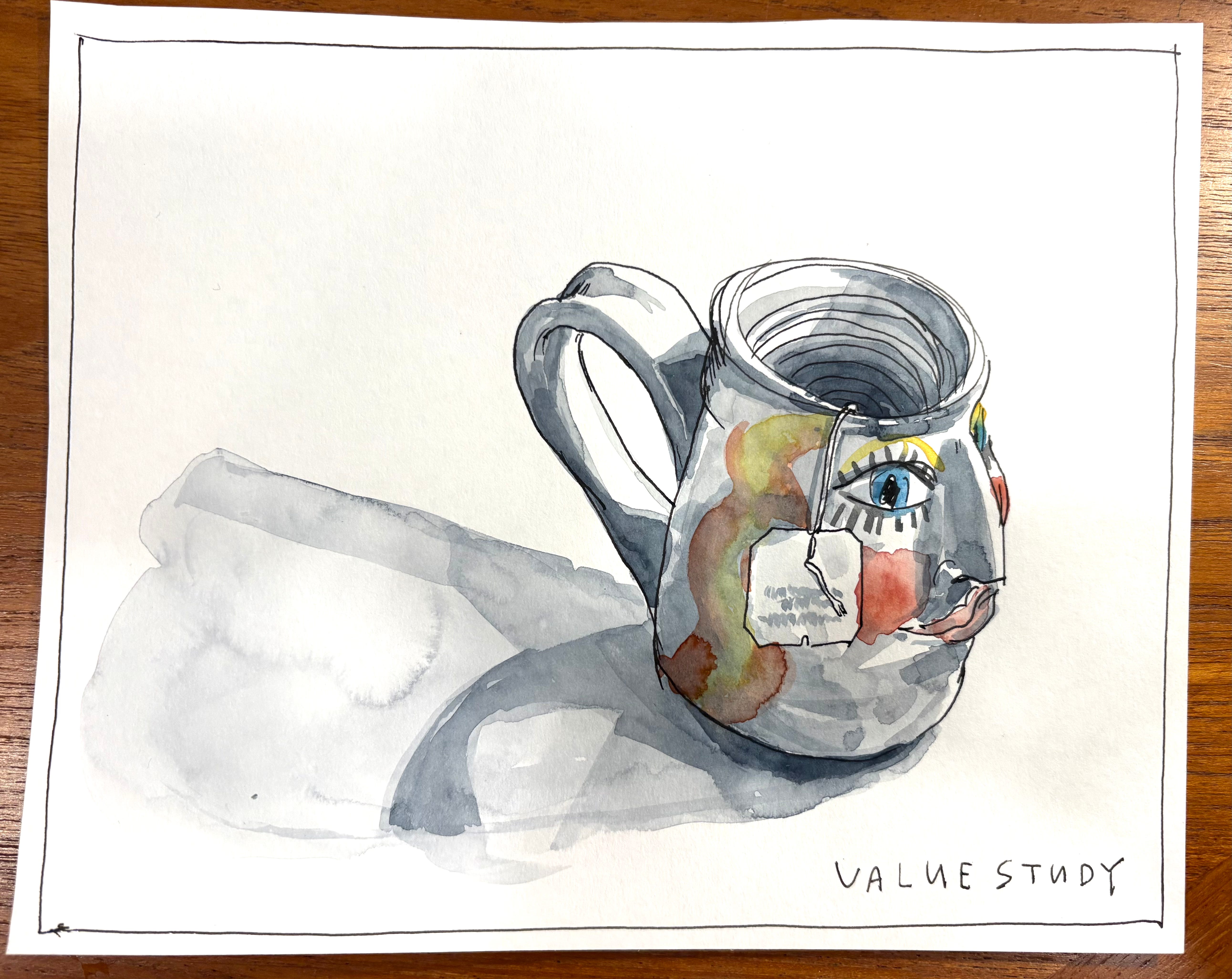
But today we’re focusing on light and shadow, not ethics. Let’s grab our pencils and paints and use value to shed some light (and shadow) on the world around us. Let’s save our drawings from falling victim to “Floating in Space Syndrome!!’ (FISS). The subjects in your drawings do not deserve to FISS! Let’s use shadow and light to de-FISS them and bring them down to Earth. Like this:

It’s as simple as that.
So, let’s start at the very beginning. (It’s a very good place to start.)
What is value?
In drawing, value is a color’s lightness or darkness. Value is how we show depth. Think about it: without shadows everything would look flat, lifeless, and 2-dimensional. The contrast between light and dark gives dimension to the world. When we talk about how light of dark something is, we use the word value.

Learning how to add value to your drawing can seem overwhelming at first. But once you get a handle on the basic principles of where light hits and how that creates shadows, you start to be able to imagine them in your mind. It just takes a little practice, and you’ll find it gets super easy super fast.
I created a little intro session for us drawers.
How Light Works 101
Alright, here are the basics. Start with this. A circle. A shape. (Remember, shapes are flat, and not 3D.)

Add a light source, and drumrollllllll……

BOOM. Circle becomes sphere. Shape becomes form. All because of LIGHT. How is the light working here?
Where the light hits, it’s light. Where it doesn’t, there’s shadow.
But look closely at the value on that sphere and on the ground. There's not just one bright light area and one dark shadow area, right? There’s a ton of gradation. What’s that about? Well, let me break it down for you:

Wow, right?? So much more than we think! Cast Shadow! Umbra and Penumbra! Light vs. halftone. Reflected light is my personal favorite: did you know that when the the edge of a curved surface is in the dark, it will often glow from the reflection of the light hitting the surface it’s sitting on?? TRUE. While we might not notice that reflection with our naked eyes, when we introduce this subtle effect to our drawing, it really gives a round object extra glowing roundness.
Okay, okay, that was a lot real fast. But take your time and really look at that diagram. This may be more than you care to know about shadow parts, but it’s really helpful to know so when you are giving your drawing depth with light and shadow, you know how to use it.
While I may say “no rules in art” when it comes to this kind of stuff, I recommend learning the rules. Then, once you do, you can toss them out the window.
How light and shadow change
Now that we know how light falls on a sphere to create a shadow, imagine a light source moving around that sphere, casting a dark shadow… How does it change it? Where does the cast shadow go? Where is the highlight? The core shadow?
Here’s a cheat sheet:

Try it yourself!
Take a little time to see what is going on in the examples above. Now, look around your room. Turn on a bright light if you have one and see how it casts new shadows on objects. Soon you’ll be able to transfer that understanding from your eyes to the paper, and eventually just inherently know how to use value (light and shadow) to create form in your drawings.
Other shapes and edges
The same rules we used in the spheres above apply every form.

Also, this is cool - the harder the light source (spotlight = hard, skylight = soft) the harder the edges in your shadows!

The more range of value an image contains, the more contrast it has. More contrast creates a sharper and more intense image. Less contrast creates a softer hums and is more mellow.
Okay, if I just totally overwhelmed you with details, sorrrrry. I get excited about this geeky stuff. Honestly, for now, that little diagram I showed you at the beginning is all you need to remember. Here it is again just in case you missed it:
Got it?
I knew you would!
Values in Art
So this wasn’t a lesson in the ethical kind of values, but it sure does lend itself to a lot of good metaphors around dark and light, no? Look for the light! No depth without a little shadow! I’m sure you can think of more. As always, life = drawing.
Alright, thus enduth the lesson. That was a lot, but also, we can’t have you getting to know shapes so well and not turning them into forms. NO FISS FOR YOU.
With that, let’s get on the DRAWING.