Helllllooooo GUT friends.
Before we launch in, one important note:
A few of you have asked, “What happens after the 30 days?” So glad you asked. Good news: WE KEEP GOING. The regular, non-30-day GUT operates very much like the 30-day GUT, but instead of every day, we do this once a week. Every Sunday I send out a lesson/reflection and a drawing prompt, then everyone shares their drawing and supports one another in a weekly chat. Same fun art and community, a slightly slower pace. The other main difference is we get visits from amazing artists and authors (past guests include artist Maira Kalman, illustrators Julia Rothman and
, musician of the Decemberists, author Gretchen Rubin…) and do things like art material reviews and rec’s, and even the occasional LIVE GUT GATHERING via Zoom…. So as we wrap up this 30 days, rest assured, our beloved GUT community is here to stay. We have so much to look forward to.On Sunday I’ll share more about wrapping up our 30-days, as well as a special announcement about a LIVE GUT GATHERING... ❤️
Alright now back to our regularly scheduled 30-Day Drawing dispatch.
Who you calling “weak”??
So many of you were outraged by the term “weak ties” in yesterday’s Single Panel Stories lesson and assignment. Friends! Don’t shoot the messenger! I didn’t make up the term, I just quote the scientists. I agree with you! Scientists should not be the ones naming issues of the heart. There were some great alt language suggestions, “casual friendships” was one. I like “loose connections” a lot. If you all want to suggest more, I am more than happy to submit preferred words to the scientists for consideration.
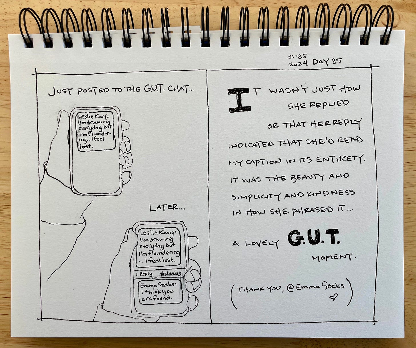
FWIW, I think we can all agree that the kind of friendships we are forming in the GUT are the opposite of weak. We may be at a distance, but the network of support the GUT offers is STRONG. Life-changing, even. Personally, I prefer the term “GUT Ties.”
Alright, let’s get on to today. Let’s get to doing some DATA.
Day 26. INFOGRAPHICS: Chosen Family Web
You know how accountants say they can read someone’s life stories in their bookkeeping numbers? I think that’s so cool. And SO BORING. I could never look at a spreadsheet and see anything more than digits. HOWEVER. Translate those numbers into diagrams, and I am captivated. The practice of using charts and diagrams to represent information and data is called, generally “Data Visualization”, or “Infographics.” And I LOVE making infographics.
Generally speaking, my infographics use classic charts and diagrams to answer the huge, impossible, existential questions. Like, “Should I check my email?”
(The answer is usually no.)
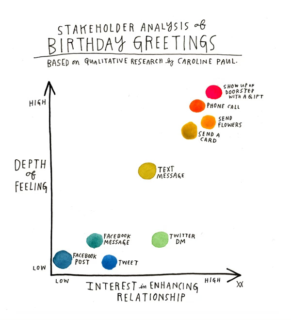
Or, “Whit Kind of Birthday Greeting Should I use?
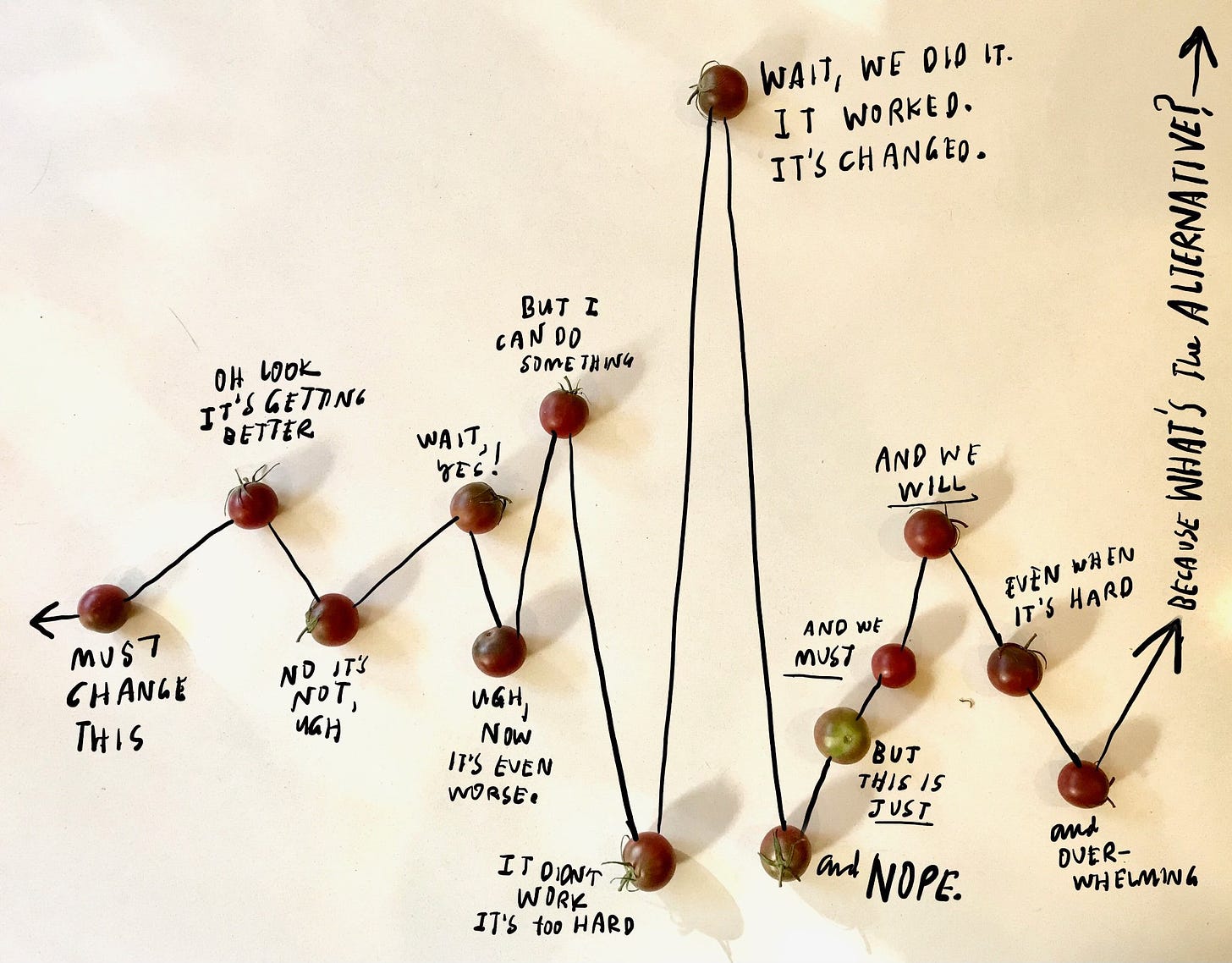
Or, “How does any change happen?”
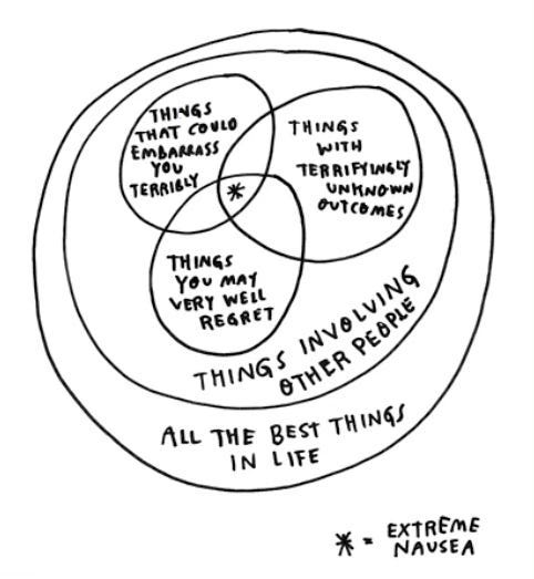
Or, “Isn’t easier to just be alone?”
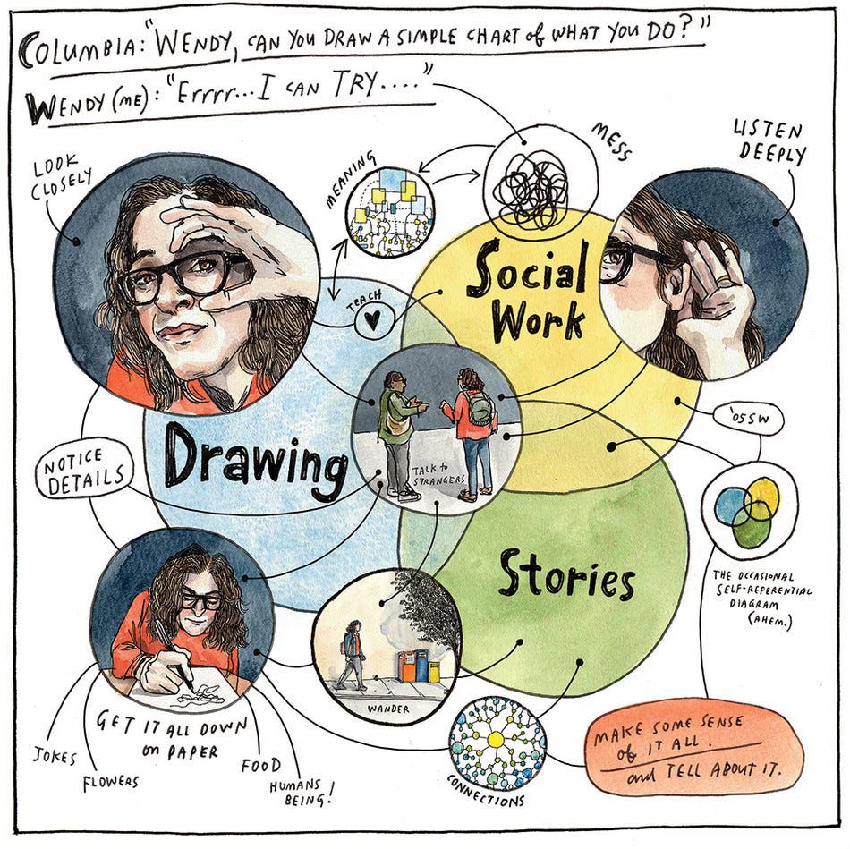
Or, “Wendy Can you make a Venn diagram to describe your artwork?”
Or maybe, “What kind of Acid should I used to cook with it?”

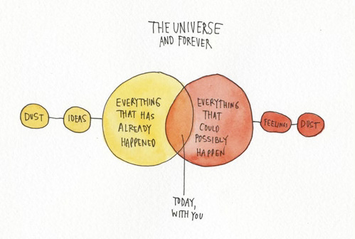
And, finally, “What is life?”
Yea, infographics can do a lot.
Like many artists, I think with my hands. Making hand-drawn diagrams helps me work out information spatially. Using my hands to create simple visual charts like the ones above enables me take overwhelming information and make it make sense - it feels more manageable, more simple. And not only to me, but to viewers, too. It makes data more human.
Hand-drawn infographics make overwhelming information manageable and, more important, human.
They are also a lot of fun to make.
Some other great hand-made chart makers include: the queen of data visualization Georgia Lupi, whose project Dear Data, created in collaboration with Stefanie Posavec, is one of my all-time favorite data vis projects. Georgia also recently published this epic, stunning, devastating data-visualization essay in New York Times “1,374 Days: My Life with Long Covid.” (Love you, Georgia!) And of course there’s journalist
classic pie charts which she has been making since 2010 (Hi Ann!) And Michelle Rial, who cleverly integrates actual 3-D objects into her hand-drawn charts and I love them. Christoph Neimann has been known to make GREAT hand-drawn charts, too and published a bunch in his book Abstract City. THE LIST GOES ON.And today friends, YOU are going to join that list.
Because today, WE are making hand-drawing infographics.
Fresh, organic, artisanal, hand-drawn infographics, straight from your brain through your hand to the page.
Today we are thinking with our hands.
But it’s fun, don’t worry.
And because this is the GUT, it’s going to be about care and feelings. And community. And love. I gotta be me. We gotta be we.
Yesterday we drew a single panel story about an interaction with a stranger that felt like a real, even if small, connection. That was a deep dive into on the “loose connections” that contribute to our well-being. Today we are doing the opposite. We are creating a general diagram of our strongest connections.
Today we are drawing our chosen family trees. But these aren’t trees, no way. I love a tree, don’t get me wrong, but when we apply them to our family structure, they are limited. The model they follow is hierarchical, patriarchal, linear and only includes genetic relationships.
And that is not the kind of family system I want to cultivate, personally. I am interested in growing a family that is more inclusive, interconnected, and creative. The shape of my family system is less lke a tree, and more like a…. web. Or a Net.
What we are going to diagram today are webs of support and care.
Let’s do it.


