


Hellloooo my fine friends who have drawn for nearly 30 days! Can you even believe it? I cannot. I am kvelling — big hugs all around!
So happy you’re here.
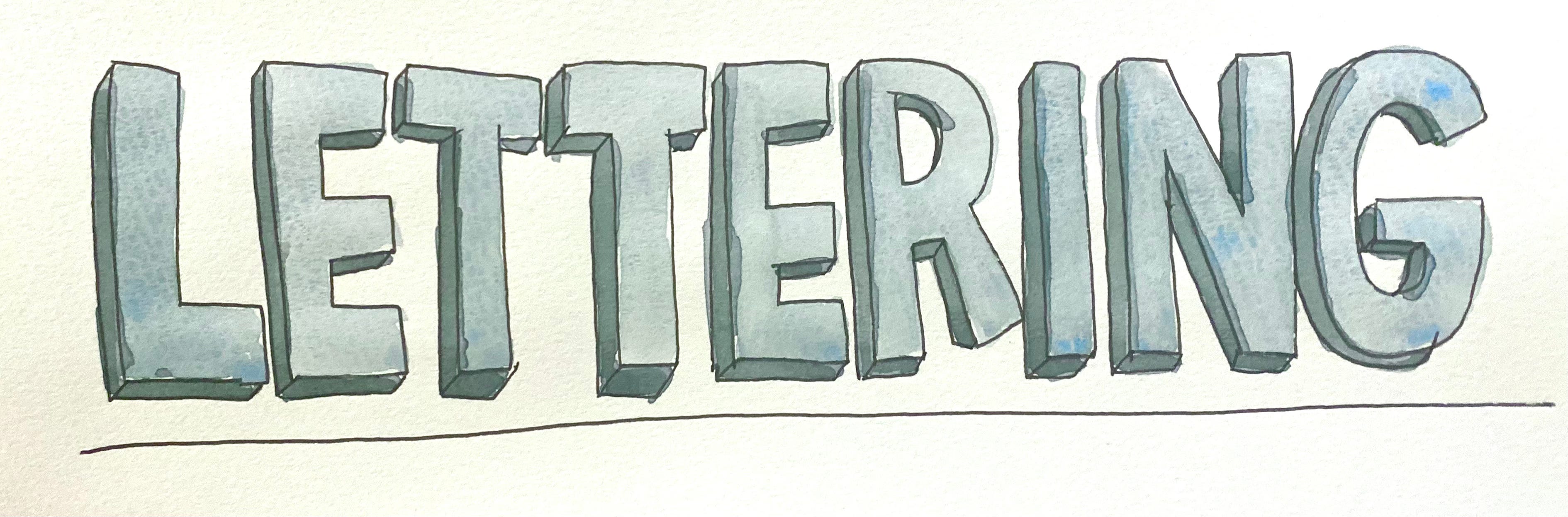
Alright. We are building on alllll you’ve drawn over the past almost-30 days to create some awesome visual storytelling this week. And while we don’t NEED text to tell stories (pictures will do quite fine, thank you very much), I believe hand-lettering is a form of drawing, and combining text and image creates a new, third thing. So let’s dedicate the day to lettering as drawing.
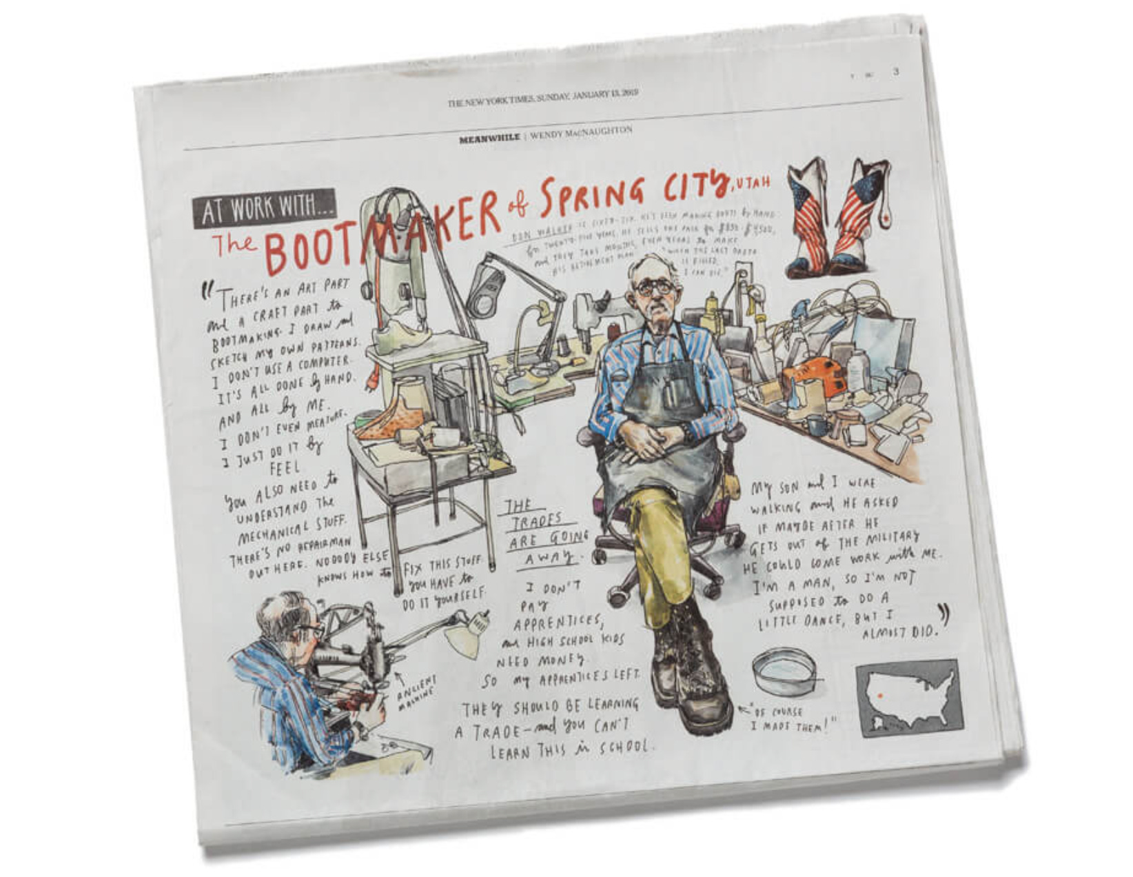
As a drawer who writes and wants my subjective experience to be considered, I use a lot of handlettered text in my drawings. I am interested in it as a conceptual and visual element, and I also appreciate the experience of slowing my brain down to the speed of my hands. My lettering has a pretty distinctive look. All caps except for small, connective-tissue prepositions or conjunctions, like “of” or “and.”
People ask me, “Do you always write like that?” I say, “When I draw, yes.” Of course it’s evolved, and it will change in the future, too. And I have other ways I write, too. My chicken scratch I use for notes to myself, sure. I use several kinds of “typeface” lettering, too. I use these “headline” letters when I am trying to call attention to something, and give something a particular feeling.
Today we are going to learn a little about lettering, and then I’ll let you loose to invent some of your own.
Lettering… GUT style. (Or, “The Wendy Way”)
General styles of type
A few categories of type to know about:
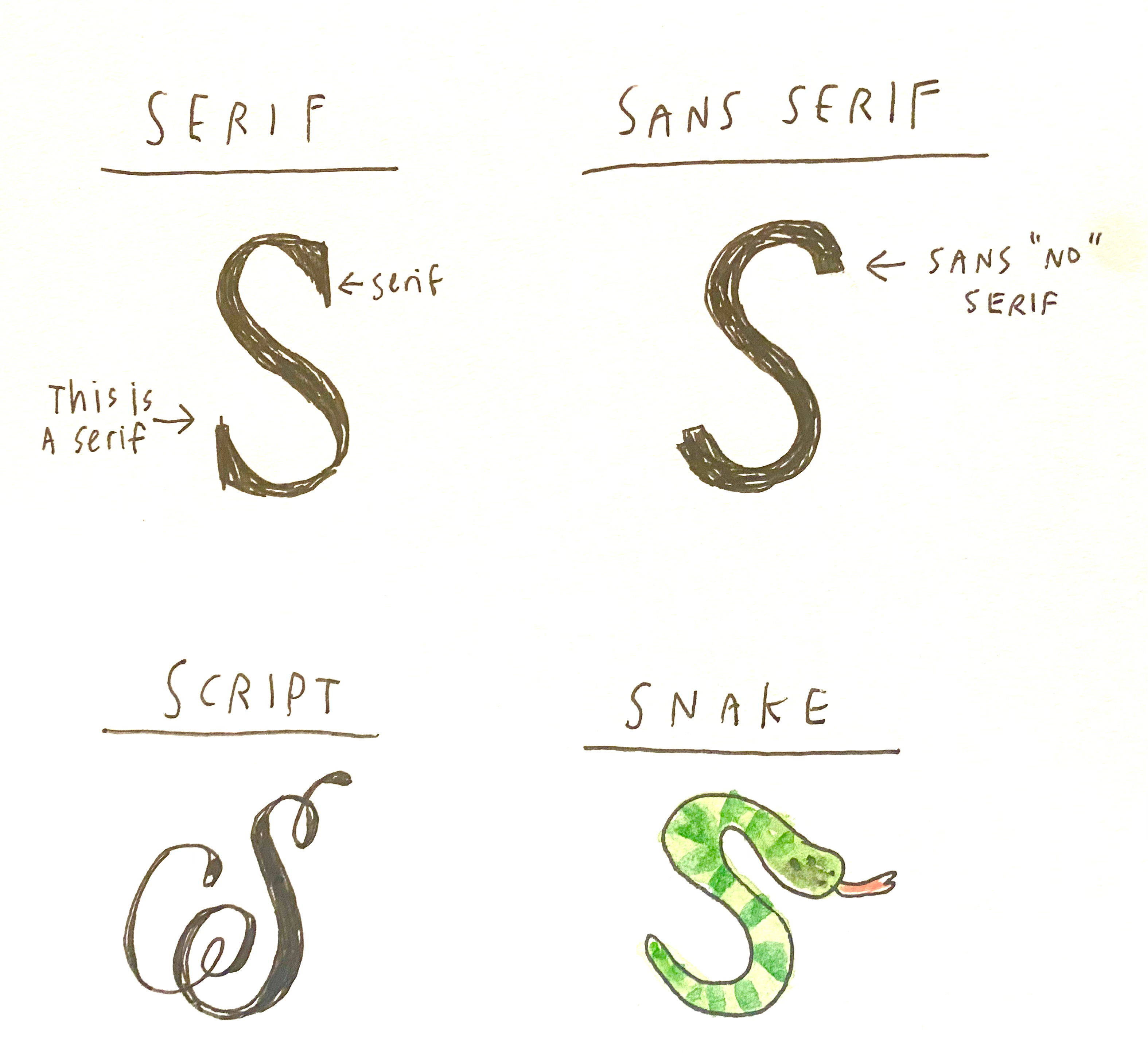
Serif has the little doodads on the ends of the letters. Those doodads are called Serifs. The reason they’re often used in newspapers and books? They make words easier to read in small print. Interesting, right??
Sans Serif translates to “No Serif” and has, you got it, no serifs!
Script is cursive, or a rounded big fancy letter drawn in, yup, script. Remember cursive? Ah, the good old days.
Snake — how the hell did that get in there?! Pesky snakes.
Writing is drawing! So there really are no rules. But there are a few tips that help with legibility, if you care about that kind of thing.
Consistency helps
If you want your letters to hold together and be read as a word, getting them “in line” helps. Understanding how lettering is laid out helps me do that when I’m hand-lettering.
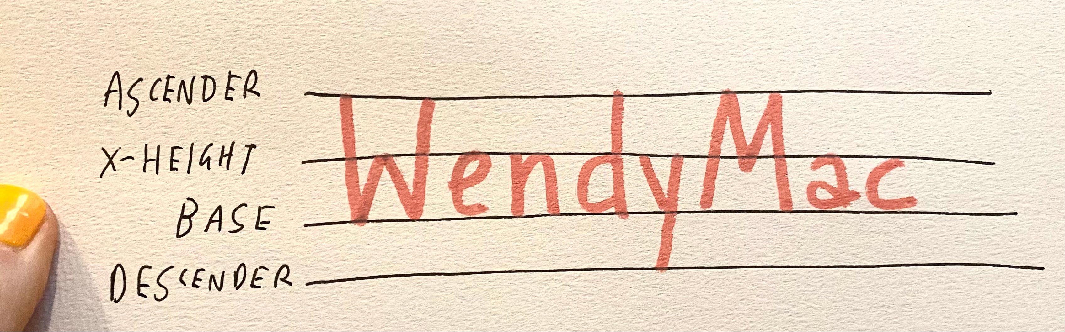
Lettering is often aligned like this:
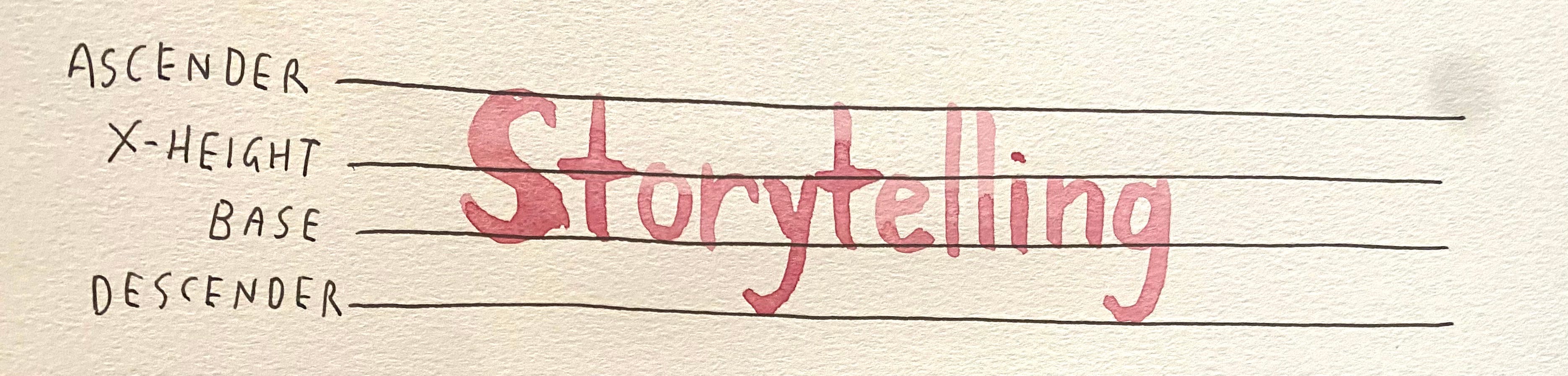
Different parts of a letter sit on or hit different guidelines.
INTRO EXERCISE: This is not your assignment, but it will break your brain open and change the way you think about lettering in the future. Try it.
Draw four lines. Then write your name so that your name sits on the base line, the lower case letters hit the x-height, the tops hit the top ascender line, and the bottom of the dangly (descending) letters hit the descender line.
Just like in grade school, right?
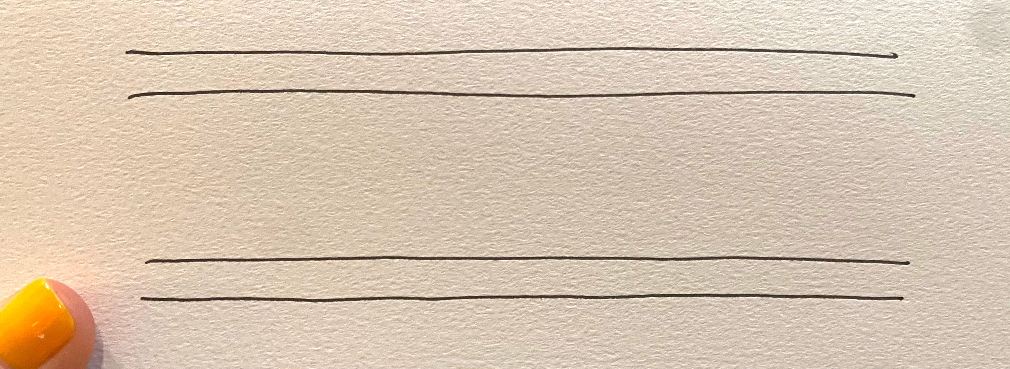
WHAT GRADE SCHOOL DIDN’T TEACH US: We can mess with the lines!! Try drawing the lines so they are not evenly spaced.
Now, do the same thing with your letters: Keep the bottom of your letters on the based and hit the x-height, etc.
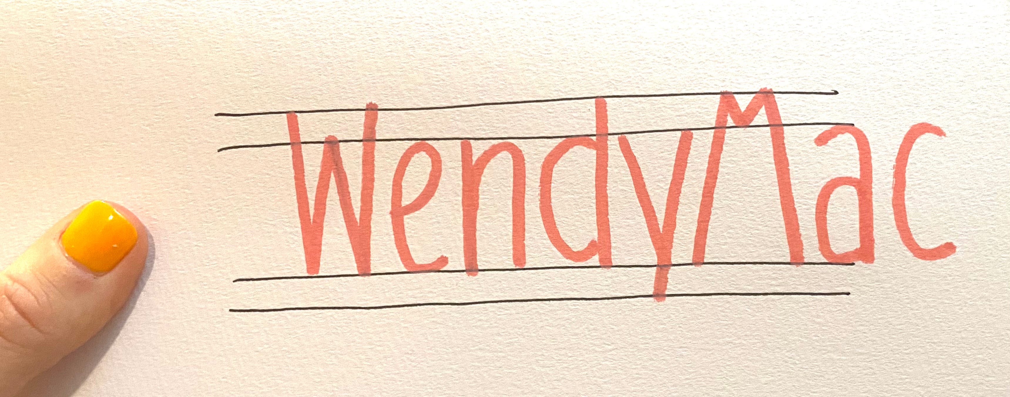
Oh hiiiii that’s fun. Let’s try it another way:
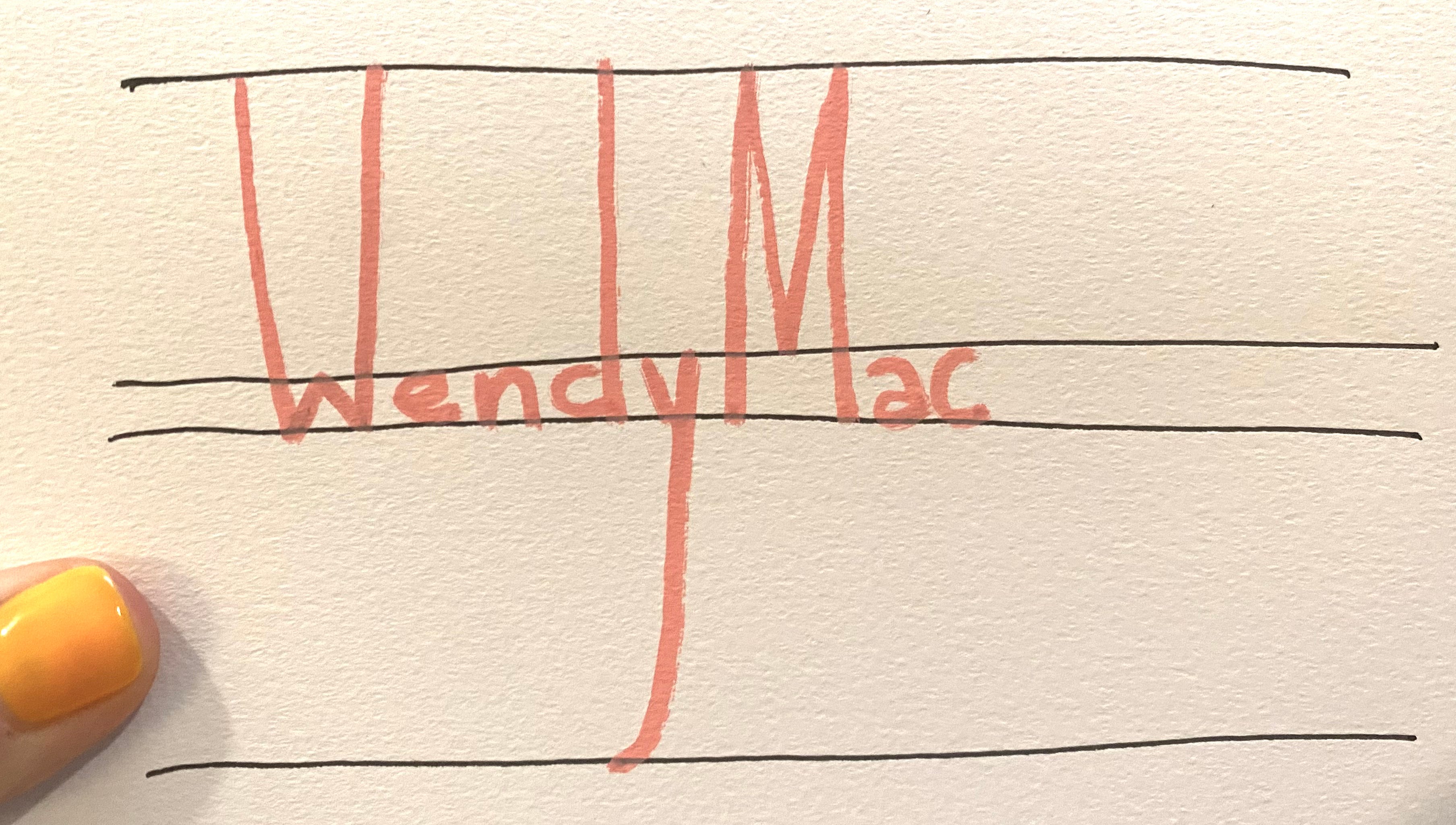
See? YOU CAN DO ANYTHING. What matters is that it is consistent in alignment and style — that way your eye reads it all together.
Same thing with your letters. Think about lettering as characters. They have personalities!
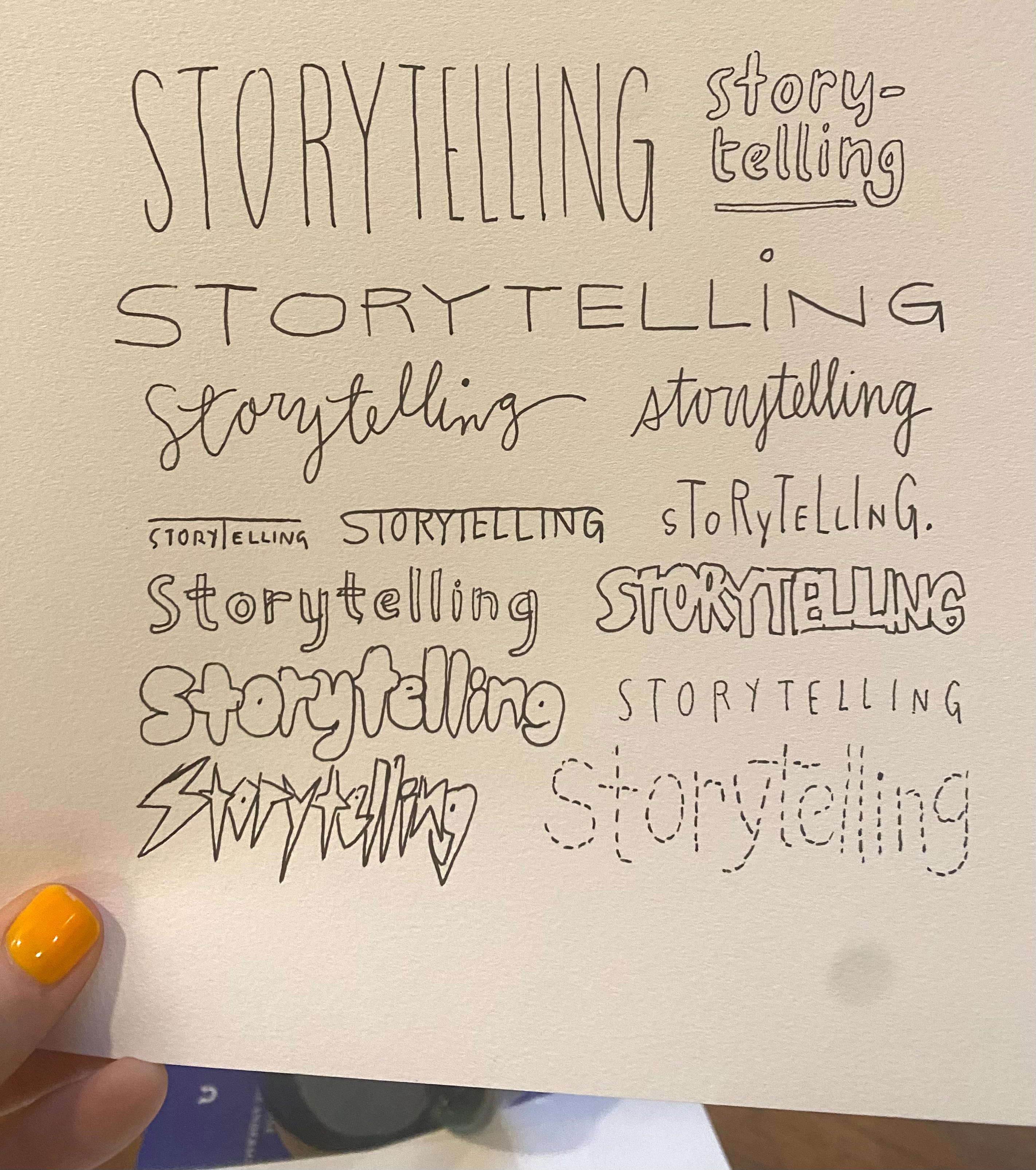
See how the style changes, but the layout stays consistent — letting the word hold together? (Unless it doesn’t, and inconsistency is consistent!) That’s really all you need to know to start playing around with lettering.
Okay, let’s learn one more thing and get onto the official assignment.
Drop caps
A drop cap is that large, fancy letter used at the beginning of a paragraph at the start of a chapter in a book. An olde-timey example:
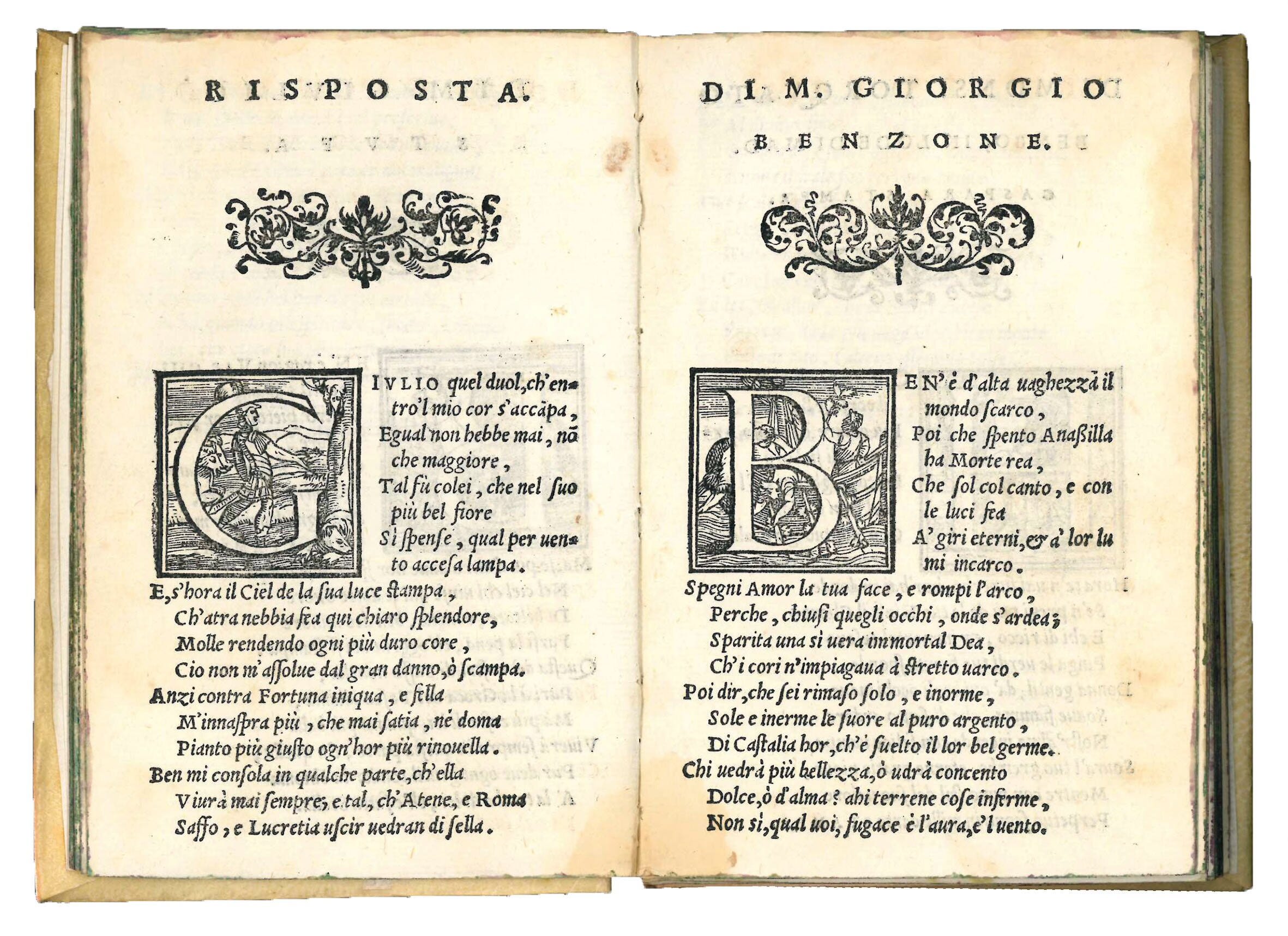
And you’ve seen them elsewhere, I’m sure, looking simpler and more contemporary.
They can be anything really. It’s just a fancy letter that starts off a word that is just as much a drawing as it is a letter.
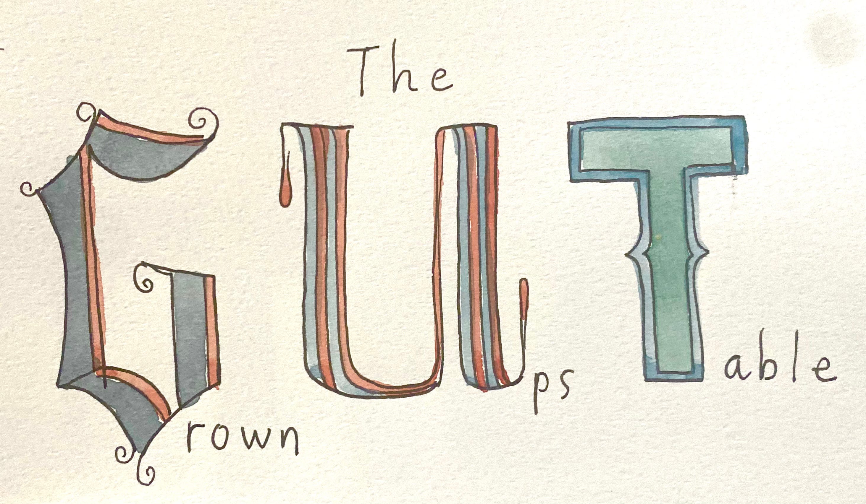
They can be fancy, but thy can also be silly creatures, be covered in flowers, whatever! They can be ANYTHING you want them to be.
It’s just a fun way to tell a little story in a little drawing. So what are we going to draw/letter today?
