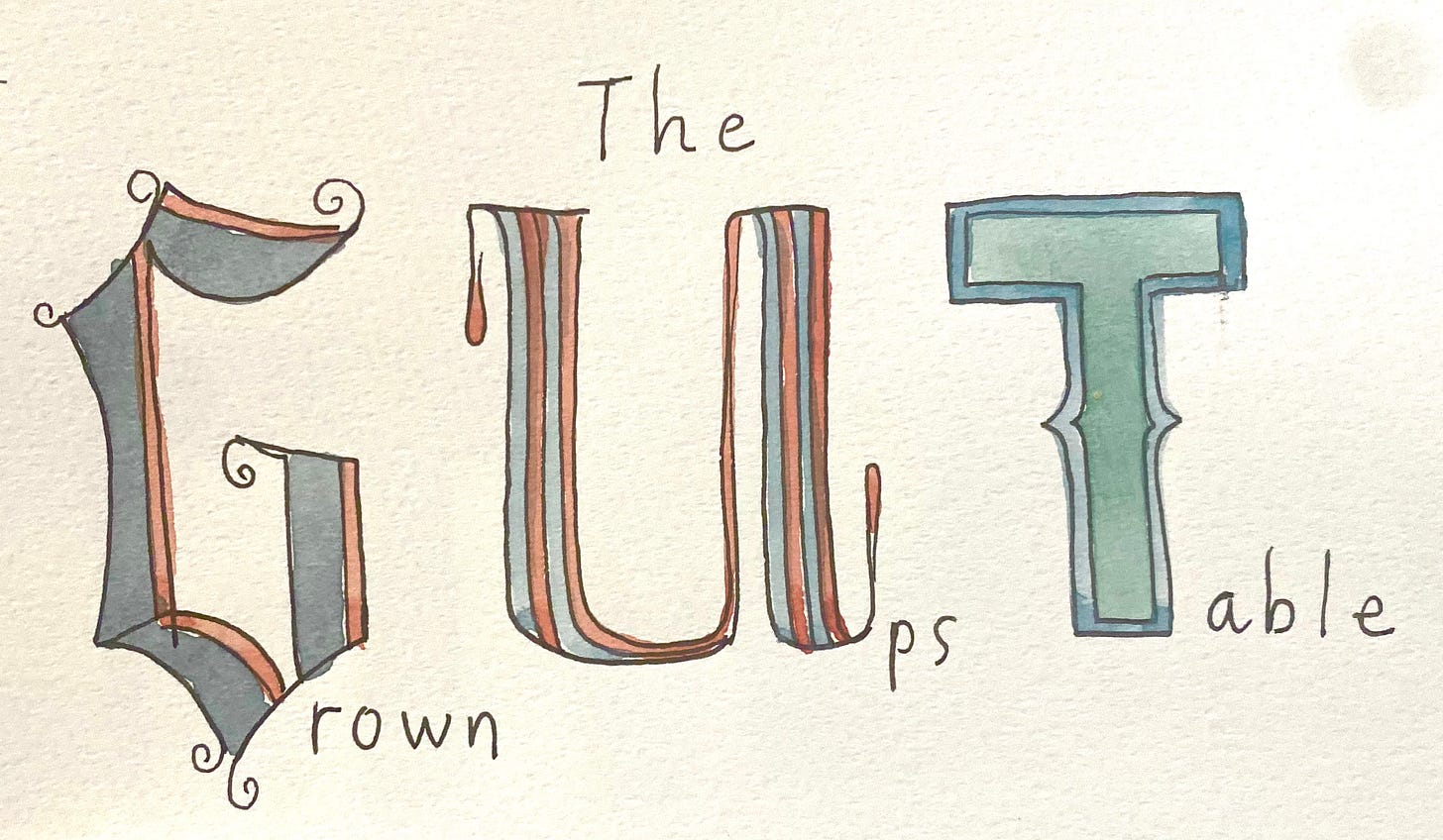
Hellloooo GUTsters.
First, I have to share a little “wow” moment that happened yesterday related to what we are doing here at the Grown-Ups Table. I checked the stats on the GUT, and guess what I saw…
Yup. In the past 30 days, our humble Grown-Ups Table has been viewed over ONE MILLION TIMES. Unless that’s my mom hitting refresh again and again (hi mom!) SO MANY people are drawing, looking and loving with us, all around the world. We’re creating something special here together, GUT. And so I’m honored you’ve chosen to be part of it.
Now onwards to our second day of visual storytelling.
Day 21. Visual Storytelling: LETTERING
I got a lot of requests from you last week for a lesson on lettering. I love that idea, and it makes a lot of sense to connect it with storytelling this week. Visual storytelling often uses text. Also, text itself can tell a whole story. It’s a whole world of story!
So let’s do a tiny little dive into lettering today.
Writing is Drawing
When people ask me “How can I develop my drawing style?”, I respond by asking them, “How did you develop your handwriting?” Handwriting IS drawing. And we learn them both the same way: by copying, then practicing, then developing our own unique style.
There are always new techniques and styles of drawing and writing we can learn and add to your toolbox.
Today, we are doing a tiny little lesson on the basics of hand-lettering to add some tools to our toolbox. My hope is that it’s fun and inspires you to incorporate something new with lettering into our visual storytelling assignments throughout the week ahead.
Sound good?
Without further ado…

Lettering… GUT Style. (Or, “The Wendy Way”)
If you want to really learn about how to use and design type you’ve come to the wrong place. I don’t know much at all. I mean, hope what I am going to share with you is right! It might be wrong! But this is how I do it, and what I find helpful to know so I can mess around with lettering in my work. And also, what I think is fun. :)
General Styles of Type
A few categories of type to know about:
Serif has the little doodads on the end of letters. Those little doodads are called Serifs. The reason serifs are used in newspapers and books so often is because those little serifs on the letters make words easier to read in small print. Interesting, right??
Sans Serif" translates to “No Serif” and has, you got it, no serifs!
Script is cursive or rounded big fancy letter drawn in, yup, script. Remember cursive? Ah, the good old days.
Snake what the hell is that doing there. Oh, snakes.
Writing is drawing! So there really are no rules. But there are a few tips that help with legibility, if you care about that kind of thing.
Consistency helps
If you want your letters to hold together and be read as a word, getting them “in line” helps. Understanding how lettering is laid out helps me do that when I’m handlettering. Maybe it will help you, too.
Lettering is often aligned like this:
Different parts of a letter sit on or hit different guidelines.
EXERCISE: Here, try this with me.
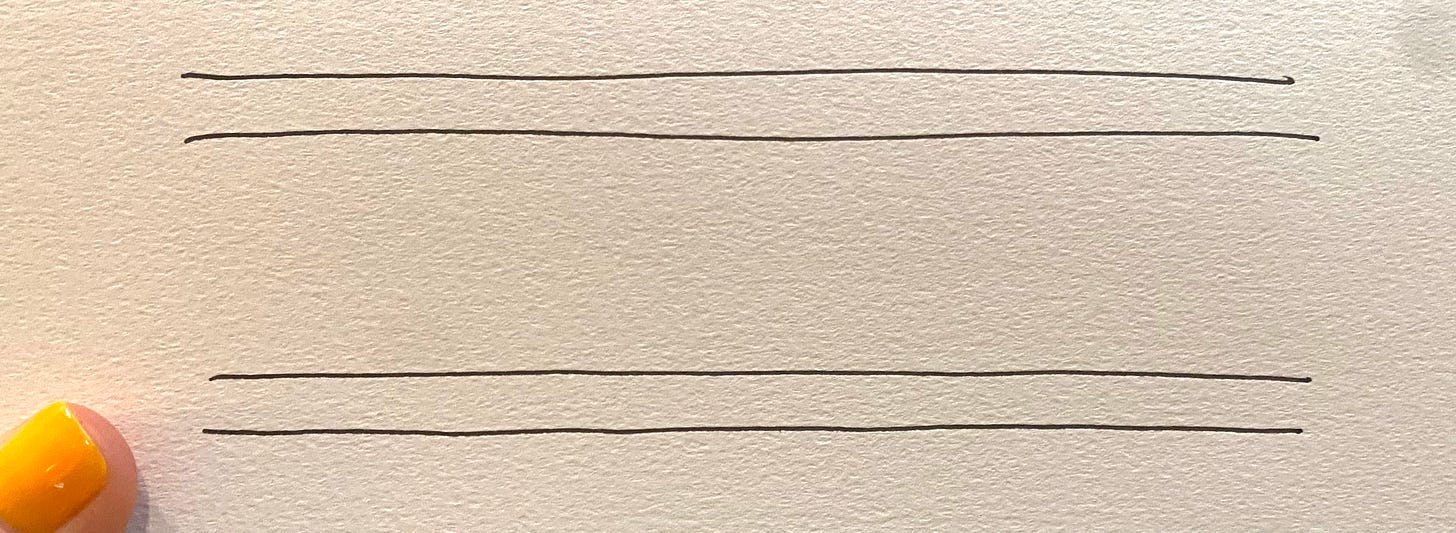
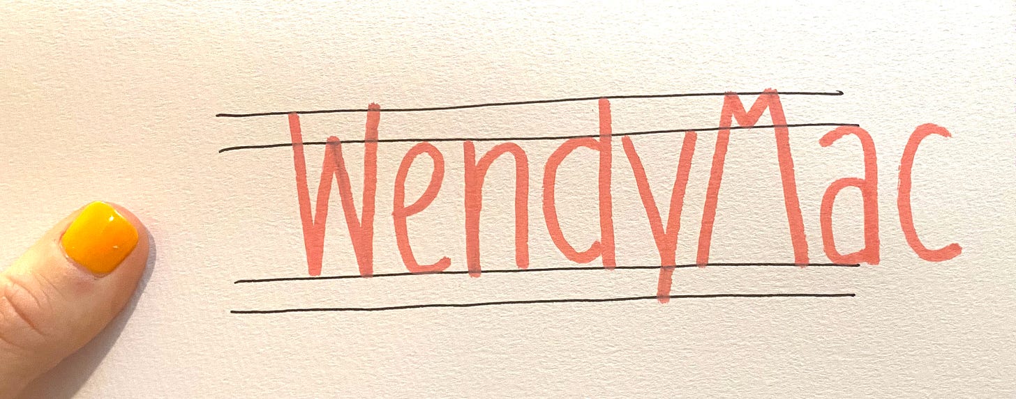
Draw four lines. Then write your name so that your name sits on the base line, the lower case letters hit the x-height, the tops hit the too ascender line, and the bottom of the dangly (descending) letters hit the descender line.
Just like in grade school, right?
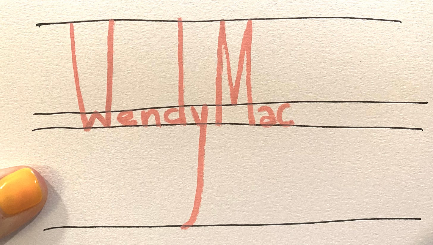
WHAT THEY DIDN’T TEACH US: We can mess with the lines!! Try drawing the lines so they are not evenly spaced.
Now, do the same thing with your letters - meaning keep the bottom of your letters on the based and hit the x’height, etc.
Oh hiiiii that’s fun.
Let’s try it another way.
See? YOU CAN DO ANYTHING. What’s matters it that it is consistent in alignment and style so that your eye reads it all together.
Same thing with your letters.
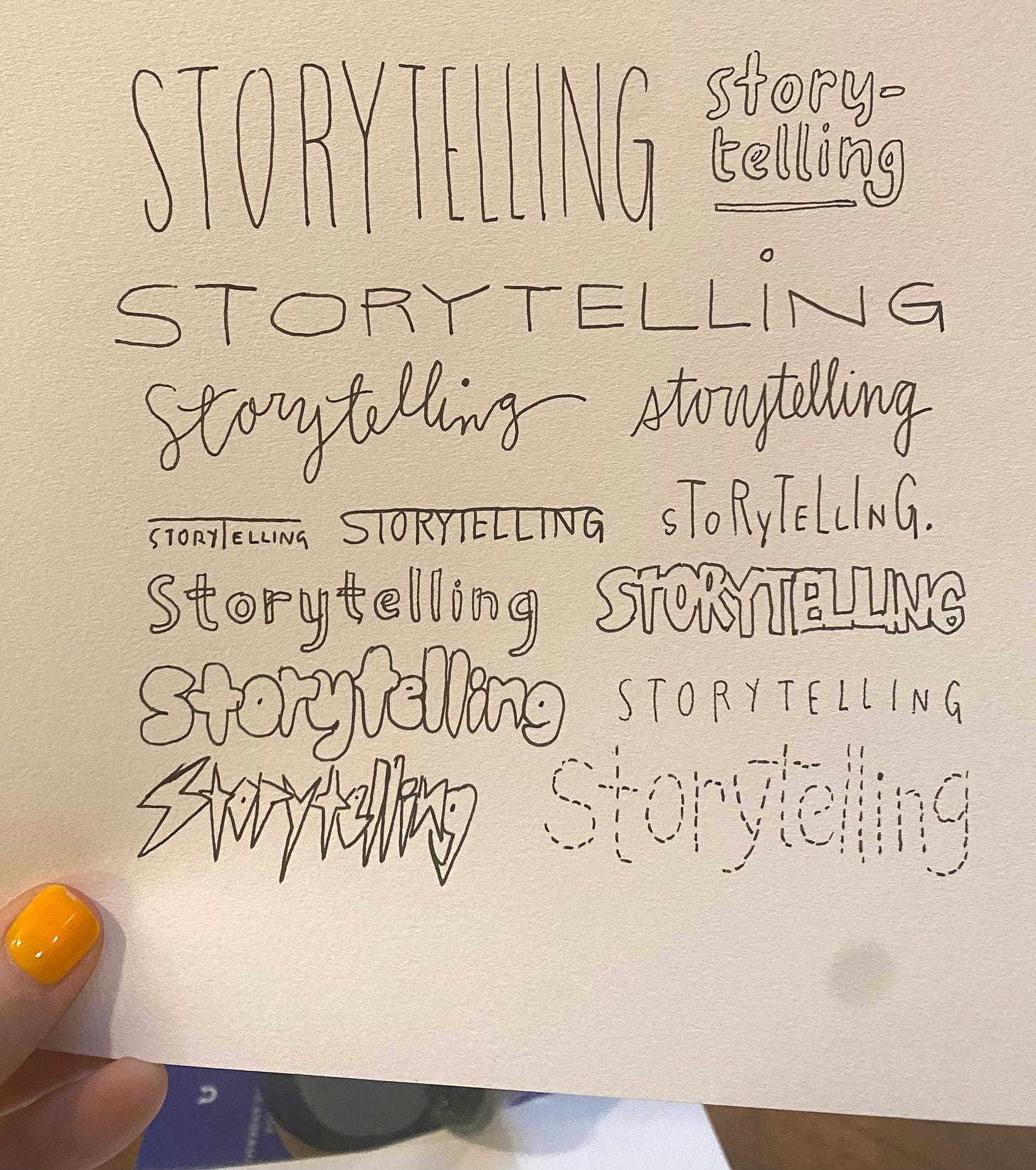
Also, think about lettering as characters. They have personalities.
See how the style changes, but the layout is consistent so the word holds together? (or if it doesn’t, that inconsistency is consistent?) That’s really all you need to know to start playing around with lettering.
Okay, I’m going to show you another thing that’s fun to play with. And this will be our official assignment today.
Drop Caps
A drop cap is that large, fancy letter used at the beginning of a paragraph at the start of a chapter in a book. Here’s an old time example:
And you’ve seen them elsewhere, I’m sure, looking more simple and contemporary.
They can be anything really. It’s just a fancy letter that starts off a word that is just as much a drawing as it is a letter.
They can be fancy, but thy can also be silly creatures, be covered in flowers, whatever! They can be ANYTHING you want them to be. They are letter-drawings that tell a story.
Here, check this out:
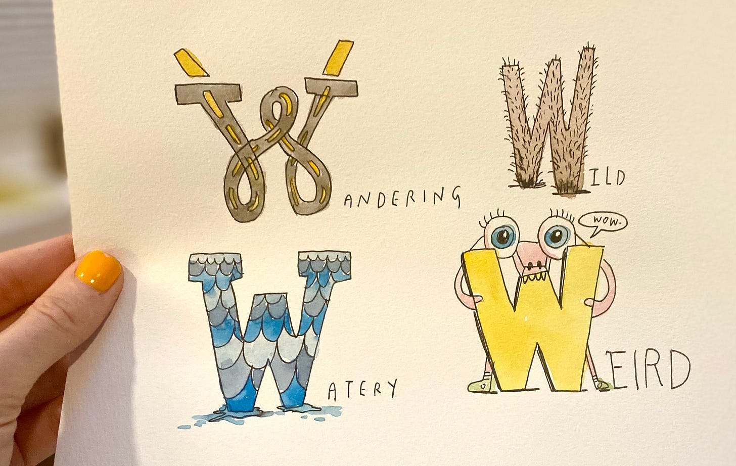
I chose four words that start with the first letter of my name, W, and then drew them as Drop Caps that relate to the word.
SO SILLY AND FUN, RIGHT? And they tell a mini story about what they are. In fact, you can imagine a sentence could start with one of these letters that would tell the story…
For Wandering: “When I first started traveling, I…” (The W would inform the story)
For Wild: “Walk around the woods long enough and you’re bound to encounter…)
etc.
Does that make sense?
It’s a fun way to tell a little story in a little letter drawing.
So what are we going to draw/letter today…


