Hi everyone!! We’re doing it!
It’s day 2 of DrawTogether in Action. These lessons will arrive every day this week and culminate in a group action on zoom on Sunday. (Info below.) If you want to support all the hard work that goes into making DrawTogether happen, and get the assignments and be part of the larger DrawTogether/GUT community, please become a member. Thank you!
Yesterday we explored an area we want to focus our attention on this week. If you missed it or if you are new, (welcome!) You can see our Day 1 kick off here.

Today, we start making stuff.
First up, we use WORDS.
Reminder, I’m hosting a live DrawTogether in Action Zoom this Sunday, the 15th at 10am PT. There, we’ll hang as a group. We’ll draw and decorate letters which we’ll send to voters in swing states to encourage them to register and to vote. To participate you need to register for the zoom here, AND sign up for VoteFwd here. Be sure to do that today - it just takes one minute. More detailed instructions at the bottom of this dispatch!
Okay without further ado, today I’m showing you a few examples of hugely impactful historical text signs, artists that use text to engage the public, and an interview with printer and activist Arley from the queer-owned letterpress Ladyfinger Letterpress in Colorado. Ready?? Let’s do this.
USE YOUR WORDS: Text as Action
Historical examples in protest
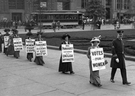
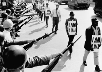
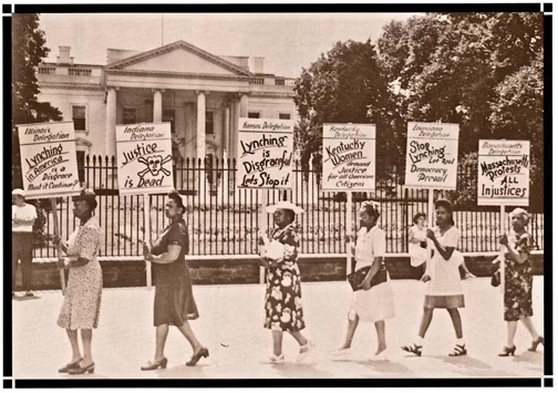
First things first: here are a few historical examples of how text has been used - and very effectively, I might say - to create visually impactful signs that call for social justice and change.
Since we are considering both message and aesthetic for our work today, look carefully at these and pay attention to how the message is constructed, and the letterforms are used.
Notice the strong lettering. The underlines. The hierarchy of information. The mixed use of typefaces (or not) in these examples.
Now think what these images would be like if the people in them were not carrying visually compelling signs.
Examples of Text in Fine Art
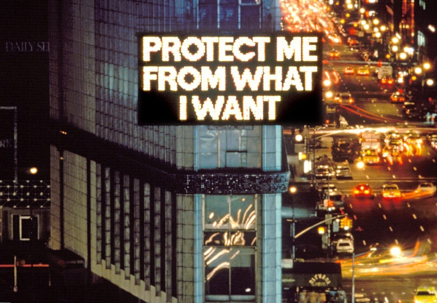
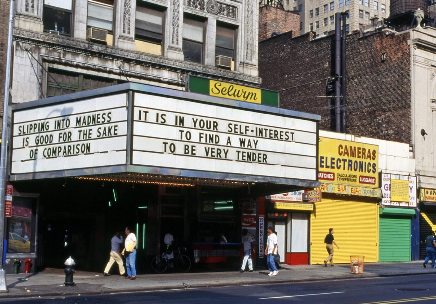
You may have seen Jenny Holzer’s work in a museum, art gallery or public space. She creates what she calls “truisms” - declarative statements that borrow from the vernacular of advertising and politics while also subverting it with deep, human truths. Fun fact: Jenny trained as a patinter and worked as a typesetter in a print studio before she started making her Trusims. One thing to pay attention to: How she uses public locations like billboards, street signs and benchs to give her words extra meaning. “The medium is the message.”
Susan O’Malley is another artist who uses bold text statements in public places. I wrote about her work here.
Or maybe you’ve seen Dread Scott’s powerful use of flags and signs, including this one that was hung outside a gallery in response to the deaths of Alton Sterling and Philando Casteel. It was inspired by banners the NAACP used to hang outside their offices.
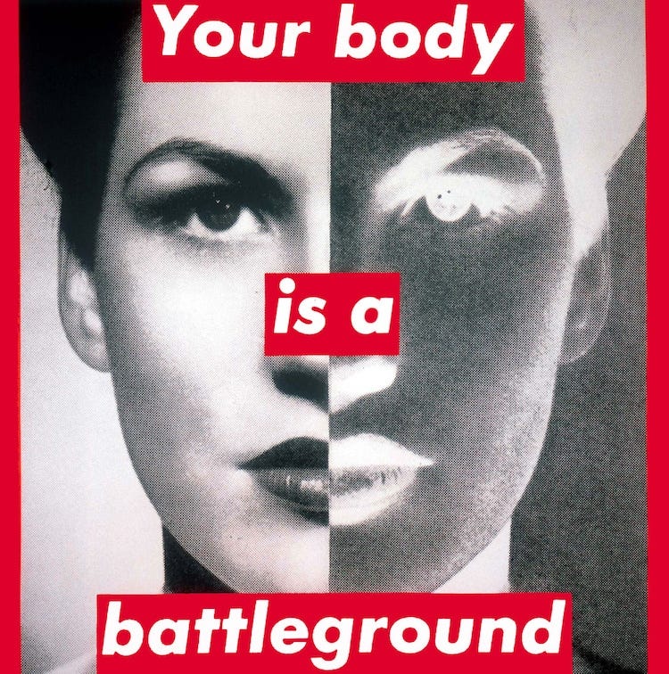
Finally, it’s true that Barbara Kruger involves image in her text-based work, but I couldn’t not include something by her. Word Queen.
All these examples demonstrate that text is itself an image. And when we use it deliberately, creatively and fearlessly, it can communicate a powerful message and make a tremendous social impact.
Q&A with LadyFingers Press
Award-winning Ladyfingers Letterpress is a Queer and Trans-owned-and-operated stationery and gift brand based in Colorado Springs, Colorado, founded by designer+printmaker couple, Arley Torsone and Morgan Calderini.


Q: Tell us a little about LadyFingers Press, and how your print work has been used for social impact?
A: You may recognize us as the folks behind the hand-lettered protest posters that are hung in the storefronts, classrooms and front windows of homes across America—particularly our “Protect Kids Not Guns” poster, (which as you can imagine, makes us literally sick to our stomachs every time we need to reprint).
We’re located in the heart of downtown Colorado Springs, our shop is a hub for creativity and community…. During the aftermath of the 2016 US presidential election, we, like many Americans, were overwhelmed with emotions. So, we did the only thing we knew how to do: turn complex sentiments into short, relatable messages. Not unlike greeting cards, people were searching for ways to say the things they couldn’t find the words for, and our protest posters gave them succinct (and well-designed!) ways to fill that void. Not only were they handy ways to get a message across at a protest or a march, but when hung at the entrance of a home or public establishment these posters became a signal about the values of the space you were about to enter.
Q. Tell us about a poster you made and the backstory on it:
Like Columbine, Sandy Hook or any of the numerous senseless acts of gun violence in our country, the Parkland shooting in 2018 shook us to our core. We didn’t have a lot of words, but the ones we had were drawn bold and large. Our “Protect Kids Not Guns” print became a rallying cry for common sense change, yet despite the breadth of its presence we sadly find ourselves reprinting it several times a year. Like our friends at Radical Emprints say, “Fight with the tools that are uniquely yours,” so as we all do our part to affect change, we will keep our hearts and shelves stocked with fortitude and ink. We hope that people will take our work and add their work to it, using whatever tools they have at their disposal to move the efforts they care about forward. It isn’t enough to repost an image or hang a poster anymore.
Q. What thinking goes into your poster-making process?
Some things we consider during our idea phase are:
Is it HELPING? Now, this may sound like a silly question, but it’s easy to say, “F THIS and F THAT!” But there is enough negativity in this world. We don’t need more complainers, we need more solutions. We don’t need more hate, we need more hope. Does this message evoke optimism, connection, empathy or strength? How does it add to the conversation around the topics at hand?
Is it INCLUSIVE? Certain topics may not apply to everyone, but is it considering all those who may relate to the sentiment? Conversely, does it put anyone down? Will anyone be able listen to the message if they feel targeted or offended by it?
NOTHING ABOUT US WITHOUT US: If it is speaking for a group (racial, religious, ethnic, etc.) that we don’t belong to, are we speaking over their voices or amplifying them?
How does it influence the perception of the movement? Is the message a good ambassador of the change it’s trying to inspire?
Does it strike the right balance of emotions (so that people can connect with it) and reason (so that it actually makes sense)?
Is it short enough? And if not, how do we design the message so the meaning “hits you”? Is the visual emphasis on the right words?
Do the words carry the weight of other connotations? Could there be any chance they could be misinterpreted?
How will they work on a layout? Are the words not only the right fit for the message but also the right size and shape for the design?
Q. What are your considerations around aesthetics, like color?
When we make posters, we usually print a run as a collection rather than one at a time, and we intentionally design them as one-color (with a few exceptions) which helps keep our production run smoothly and keep the price as affordable as possible. To be honest, our decision-making process is pretty simple and is based on visibility and ease of production. We print in either a bold red, dark navy or neon red ink and select from a set palette of lightly-colored papers… The goal is for each print to stand on its own, but also add to the visual harmony when they are all pictured together.
Thank you Arley and Morgan!! Check out all of Ladyfingers awesome signs, stationary and printing on their website.


