Good morning, my steadfast creative companions.
Before we dive in, an opportunity to help: Our friends at the Corita Art Center in Los Angeles are distributing Sister Corita-Inspired art kits to people impacted by the devastating fires. If you have been watching from afar and wondering how you can help, this is a great way. CLICK HERE to donate and give an art kit to a kid, caregiver or vulnerable adult. Thank you. ❤️
Okay, I am excited for today. This is a good one. A classic. A seriously solid Sunday lesson.
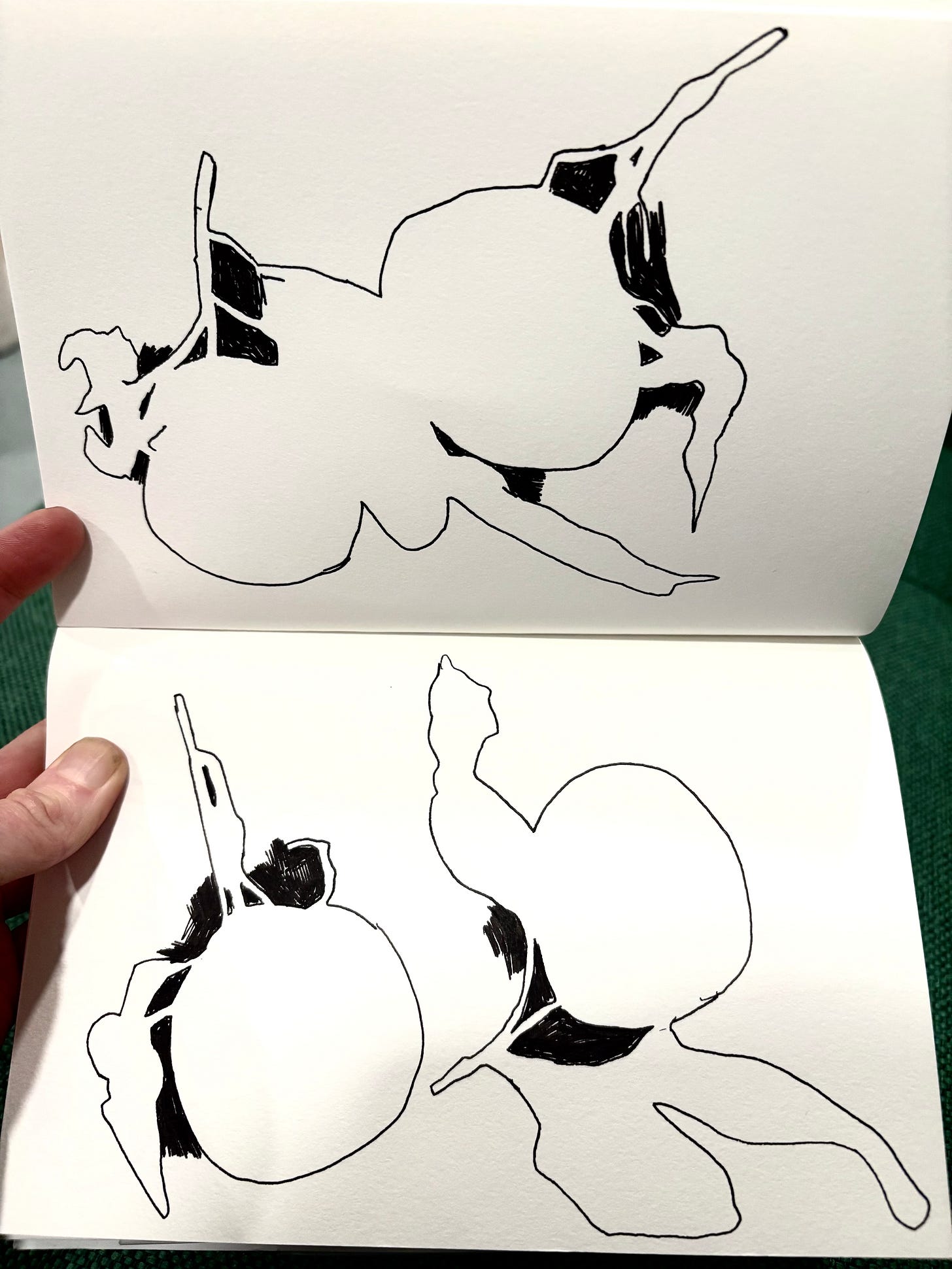
I pulled some of this from an earlier GUT dispatch, so you OGs (original GUTS & 30 Day crew) may remember some of this. I’ve updated it to include some new art and artists. Also! I have a special gift for subscribers today: My dear friend and wonderful writer/composer/musician Chris Colin made a ten minute drawing soundtrack for us! Really. It’s instrumental and relaxing and also funky and weird. I listened to it while writing some of this lesson and while drawing today’s assignment and I think it’s perfect. The ten minute song accompanies the assignment section of this dispatch so members can listen while we draw today’. Thank you, Chris. ❤️
Alright, without further ado, let’s….
Focus on what you don’t yet see. Yet.
Today we’re focusing on “Negative Space.” Negative Space, also called White Space, is the area that surrounds a subject. (The subject is the Positive Space.)
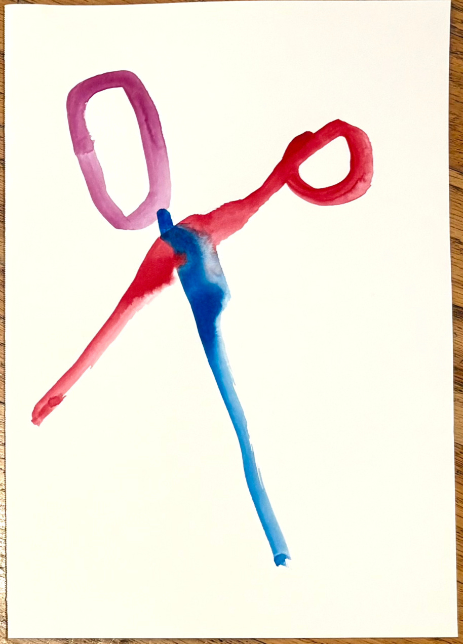
Example: Take those scissors I drew and shared yesterday:
The scissors are the positive space. The negative space is the empty area all around and inside the object: the space surrounding the scissors, and the areas inside the handle. If you look closely, you will start to see that this isn’t juts empty - they are also shapes.
Try it: see if you can adjust your eyes and brain to focus on the negative space instead of the scissors. Look at the areas inside the handles. Can you see those shapes? How about the area to the right and below the scissors? Can you turn that from background into a shape in itself? It’s hard to get your mind to switch at first. But with practice, you start to see it. And then everything changes.
The more we draw, the more we start to notice negative space. The more we are able to notice it, the more we see what we pay attention to, and we don’t.
When we first start drawing, many of us pay attention exclusively to the subject of a drawing or painting. We just focus on the positive space. But negative space is equally important in a drawing. The more we draw, the more we start to notice negative space. The more we draw, the more we start to notice negative space. The more we are able to notice it, the more we see what we pay attention to, and we don’t. What we value, and what we don’t. In terms of art, we can use it to help our drawings do what we want them to do. In terms of life, it can be a profound shift of awareness. It’s tough at first, but it just takes practice.
What does negative space do?
Negative Space performs many functions: it focuses our eyes on the subject, it moves our eyes around a drawing or it keeps them still, it allows for visual space/room to breathe, and sometimes it gives the subject an extra layer of meaning.
For example, ever seen this logo before?
Sure, you’ve probably seen it a million times.
But have you noticed the hidden symbol in the logo?! Focus your attention on the negative space of the logo - the space between the letters. Do you see it? Look between the E and the X. Now do you see the arrow?? YES. It’s subtle. It took me YEARS to see it. But once you see the arrow formed by the negative space you can’t unsee it. In this case, designer Lindon Leader used the negative space to create an image that informs the meaning of the subject. An arrow takes your package from here to there. Very clever, Lindon. (Apparently it took Lindon over 400 sketched versions before he saw the arrow formed by the E and the X! Even the best trained eyes miss things - and then turn them into the most creative solutions.)
In other cases, negative space can tell a story about what’s NOT there. Historian and sociologist W.E.B Du Bois established the first school of sociology (ever!) at the historically Black college Atlanta University. While there, he collected data on the lives of African American in the late 1800’s. When he was just 30 years old, Du Bois was invited to exhibit his research at the 1900 Paris World Fair. His presentation became the foundation of modern data visualization, and are great examples of using positive/negative space to tell a visual story. Here is one example:
This bar chart tells us what jobs African Americans held in 1890. The Subject is the red lines. The subject tells us what jobs African Americans held at the time (agricultural, farmers, laborers, a few barbers.) The Negative Space is the space around the red lines and text. What does that tell us? It tells us all the jobs African Americans were kept out of (teachers, clergymen, printers, engineers.) When we look at the positive and negative space together, we see a story about how a huge disparity in distribution in power. By focusing on the positive AND the negative space, we are able to see a richer story.
W.E.B. Du Bois’s Data Portraits: Visualizing Black America is a phenomenal collection of his data visualization. It’s a source of endless inspiration to me and many others.

All the above also applies to visual art, too.
Spacial Elements in Drawing
Since we are doing some basic Fun Lessons, here’s a wee primer on how space is used in visual art, especially 2D like drawing and painting.
How to think about using negative space in drawing
Composition is the way elements are arranged in space. That could be on a canvas, on a piece of paper, in a room, etc. In every composition there are three spacial elements: Positive Space (subjects), Negative Space (the space around the subjects), and The Frame (the boundaries of the paper/canvas/room you are working within. YES, LIKE CORITA’S FINDER!) You can do anything you want with those three elements, but they will always work in unison. How you arrange them creates harmony, tension, focus, overwhelm, you name it. You can never have one without the other two.
Let's look at some examples by some of my favorite aritsts.
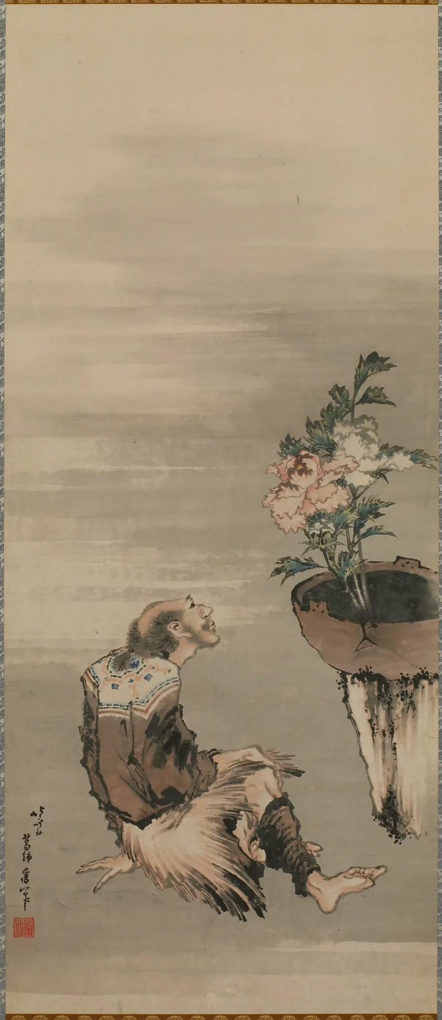
Here’s an example of these three elements working in unison (with special attention paid to Negative Space) - a painting by Japanese artist Katsushika Hokusai.
Hokusai has removed everything except the man, the flower in its pot, and his signature (the subjects.) The quiet, grey space around the subjects is the Negative Space. By creating all this negative space, Hokusai pushes us to focus on the subjects. He also has arranged the positive and negative space within the frame to draw our eyes first to the man in the middle, then up to the flowers on the right, where our eyes rest and we gaze at the flowers. Just like the man in the painting. So simple and effective.
Okay, here’s another example:
This painting is by the American artist Andrew Wyeth. Like the arrow in the FedEx logo (I can’t believe I’m comparing Wyeth to FedEx!) the subject (the drapes) frame the negative space (the sky). The rectangular frame of the canvas contains the space and helps our eyes to move around. Notice how the diagonal shape of both the curtains and the negative space billow in strong contrast to the horizontal and perpendicular lines of the frame. Working together, these elements create an interesting composition that tells a story and communicates a mood.
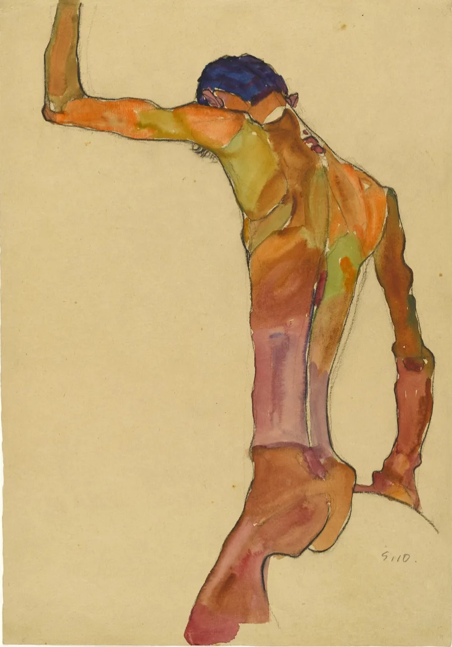
Now one of my all time favorite artists since I was in high school: Egon Schiele. A Viennese painter whose life was cut short at the age of 28 by the Spanish Flu.
Gah, right?!? Look how Schiele uses the three elements of composition. Look at those negative shapes! Look how he arranged the subject to create the negative shapes at the bottom, how graphic and moody and striking it is! The Composition!! AHHHH I LOVE IT SO MUCH!!!! And yes I’m shrieking. Try and stop me.
Here’s another:
Kind of like those scissors at the top, right?? SO GOOD. An Austrian painter (b. 1890) Schiele studied under Klimt and is known for his drawings and paintings of people (esp nudes) and landscapes. His work is full of harsh angles and surprising shapes created using negative space. I think we can all learn so much about composition by looking closely at Schiele’s work.4
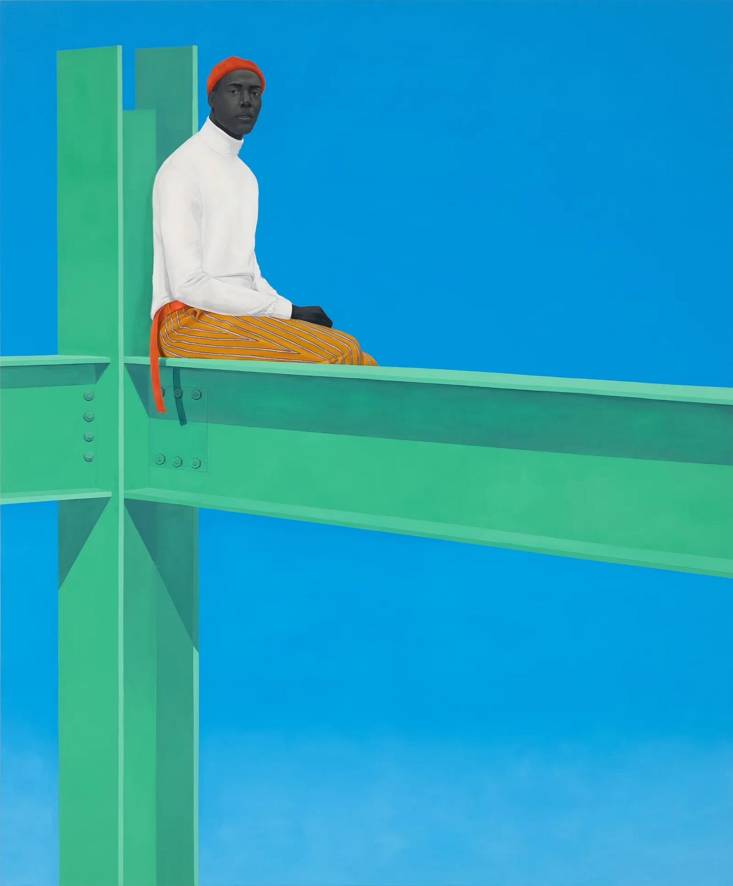
One more: the gorgeous artwork of Amy Sherald.

You may recognize Sherald’s work from her famous portrait of Michelle Obama and Breonna Taylor. Sherald often uses a single color as a background for her subjects, forcing your attention squarely onto her subjects. Sherald paints portraits of contemporary Black people and Black life.
By making the background a single color/keeping it negative space, she places her subjects in a vibrant, liminal space, and we are forced to meet her subjects on their own terms. And they are powerful.

And with that, let’s look for what we cannot yet see, and discover all the beauty that exists outside the obvious.


