


Hello, my fine GUT friends. So happy you’re here.
If you’re anything like me, this past week left you reeling. And steaming. And screaming! And deep breathing. So. Many. Feelings. And all I can say is I’m happy we’re here, together, drawing our way towards a better future from the inside out. We’re playing the long game of love. Creativity. Curiosity. Care and connection. And so we keep going. One pencil line in front of the next.
So let’s do it. Let’s keep drawing.
So happy to see so many of you enjoy last week’s watercolor lesson with Jessie Kanelos Weiner. I loved seeing GUT member’s transparency paintings in the chat - so much play, experimentation, and patience (IMHO, the toughest drawing skill of all.) Wonderful to see so many of you return to it over the week, often doing two or more paintings. Huge thanks to Jessie for jumping in and encouraging everyone in the chat. And! BOOK GIVEAWAY: Randomly selected GUT members Cathy R and Donna Zuckerberg, you won a copy of Jessie’s new book. CONGRATS. Email community@drawtogether.studio and we’ll hook you up.
Speaking of watercolor…
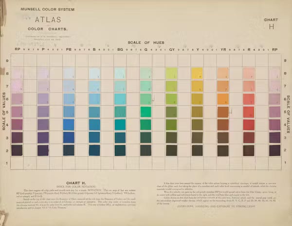
COLOR. That’s what we’re talking about this week. From swatches to science, there is so much to learn. If you just joined us in the past few months, check out the lessons we did with Guest Artist Lena Wolff (whose color class at my new studio this month is *sold out*, but she just announced she’s offering another series this fall.)
I was talking to a friend who has a fantastic eye for all things color and interiors. We realized that while we both have a good knack for choosing color, we also have a challenging time understanding WHY we choose the colors we do. Turns out, there is one very basic, very essential aspect of color we don’t really understand: VALUE.
Value is how we perceive light and dark in color, and it’s something we often take for granted, but is a big part of choosing colors. So, that’s what we are going to learn together today.
I think you’re gonna be amazed.
Okay, ready? Let’s do this.
Artist’s Colorful Values
“Value does the work, but color gets the credit.”
Value
Okay, first thing’s first. Let’s do a quick refresher: What is value?
Value is artspeak for light and dark, and it is one of the fundamental elements of drawing, and all art. Value is, in a sense, light. Light creates contrast, color and, well, everything visible. We make choices around it all the time. When we observe how light or dark something is, we assess its value. When we decide to draw or paint something lighter or darker, that’s choosing value. The more we understand it, the more we notice it. The more we notice, the more we see!
Remember when we explored light and shadow? That was value. Think: white, black, and all the shades of grays in between. This is value:
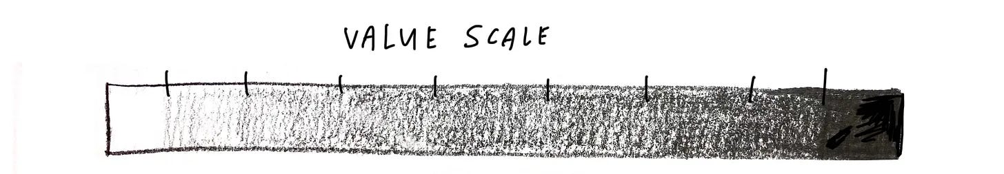
When we look at this grayscale above that ranges from bright white to deep black, it’s pretty easy to determine value. Most of us can look at it and say that the part closer to the white is lighter than the part that is closer to the black, right? Right.
But what about when we apply this to color?
Value in Color
Below is a color wheel. Can you tell which color is the darkest color? Which color is the lightest color? Could you arrange the colors in order from dark to light, like in the grayscale bar above?
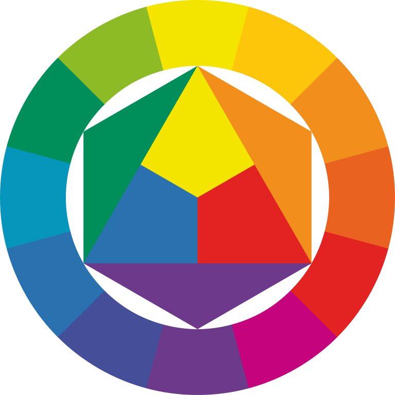
Not as straightforward, huh?
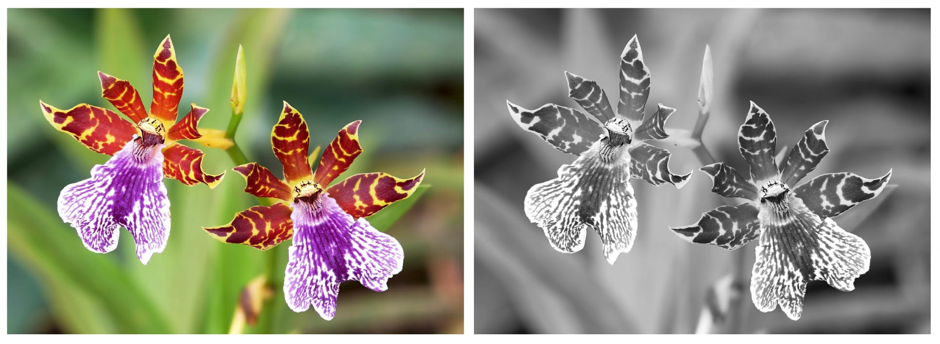
If you’re like me and have a hard time instinctually knowing the value of colors, one way to see the value of a color is to remove all saturation (meaning intensity of color) and turn a color image to grayscale.
Here is the colorwheel above in grayscale:

Suddenly we see the color’s value! Yellow is light, purple is dark, and blue and orange in the middle. And how different shades of colors are different values. Mindblowing, right??
Want to try this yourself? You can remove the color (aka desaturate) any color photograph on your phone using the filters in your photo app.
To desaturate a photo on an iPhone:

If you are using an android or other smart phone, do a quick search to learn how to remove color from your photo and just focus on value.
COLOR VALUE QUIZ
Alright, here are five colors - each with a different value. Can you put them in order from light to dark?
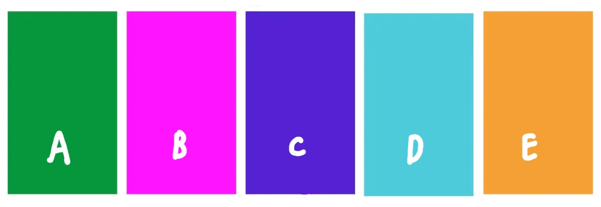
Find the answer below, with today’s drawing assignment!
Why Play with Value?
Value is present everywhere in the world, and in our drawings. Value helps convey the mood you’re going for in your artwork, moves people’s eyes around a drawing, and creates sharp (or fuzzy) separation between areas and objects.
Fun fact #1: in UX design (that means designing for the internet) it’s important to consider value and contrast because people see color differently. People who are color blind will have a very different visual experience than someone who is not, so value and contrast are essential in communication to differently sighted people.
Fun fact #2: Studies have shown that turning your phone to grayscale makes it less enticing to the eye and results in less phone use. So if you want to decrease your screen time, TRY THIS.
All the Wrong Colors!
Here are a few examples by artists who let go of representation when they are choosing colors, and rely on value to help keep the subject coherent to the eye:
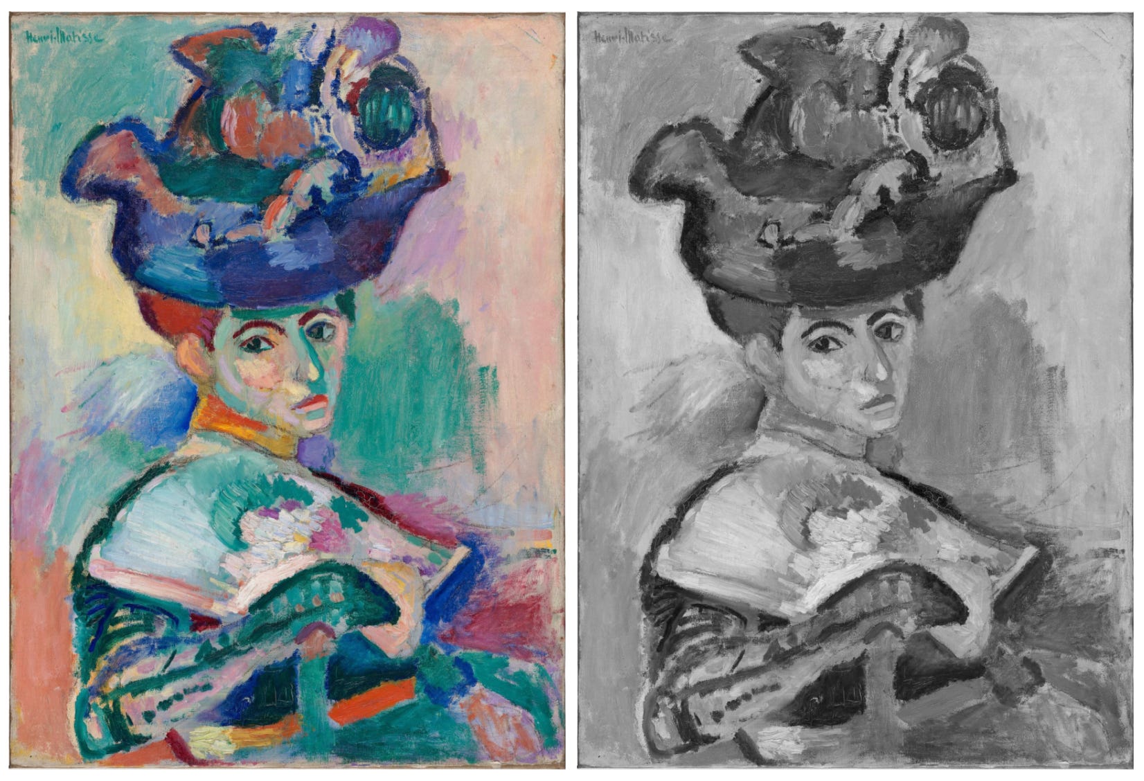
Look at the full color painting by Matisse, Woman with a Hat. The colors are “all wrong”, yet they somehow look right. How is that possible? How did Matisse select his colors? Remove the saturation/color from the painting and we get a hint: Matisse chose his colors largely based on the VALUE of the color, not the hue.
Amazing, right?
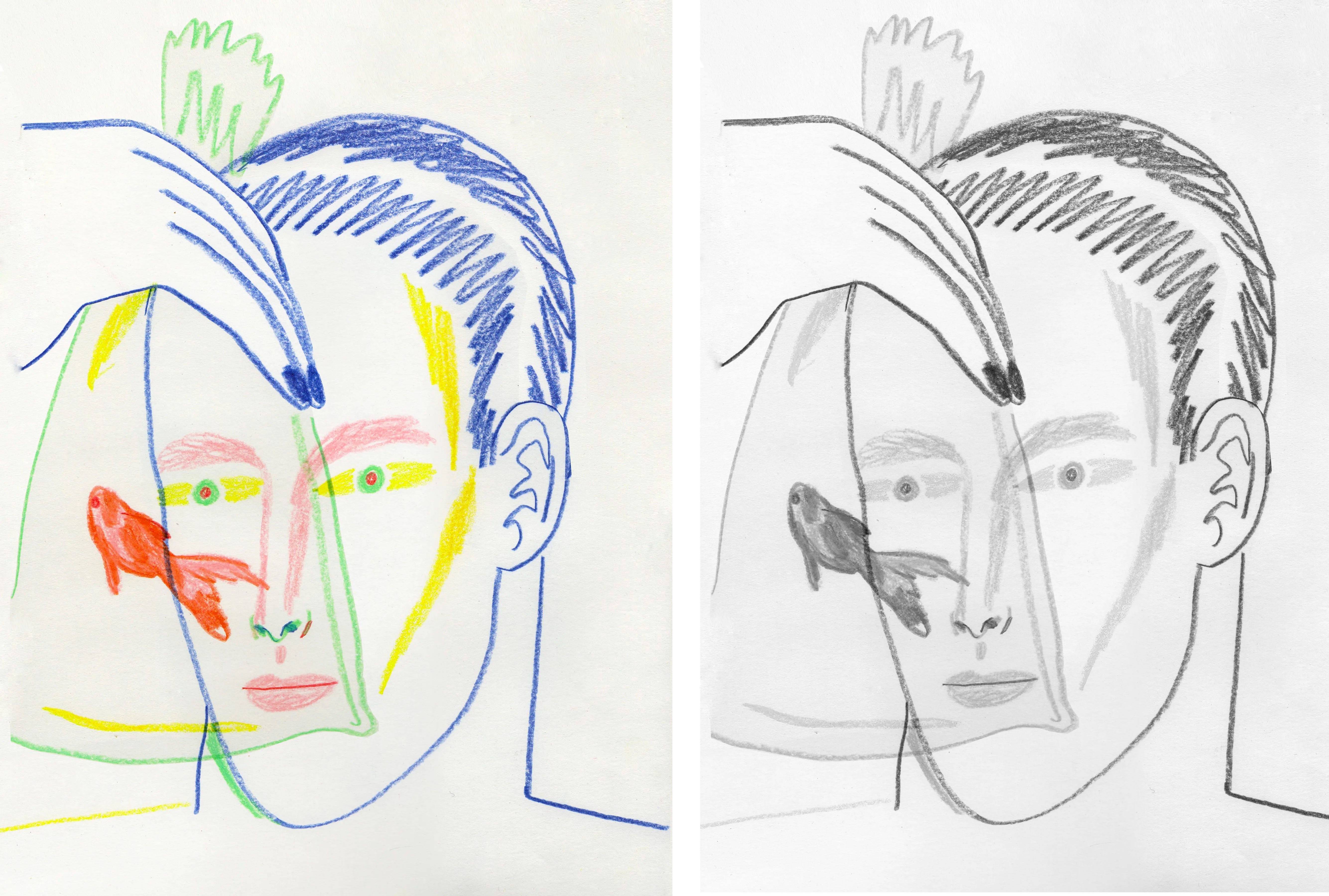
Here’s a couple more fantastic examples by brilliant Brooklyn-based illustrator Ohni Lisle. Ohni’s colorful work plays with hue, while keeping value pretty straightforward.
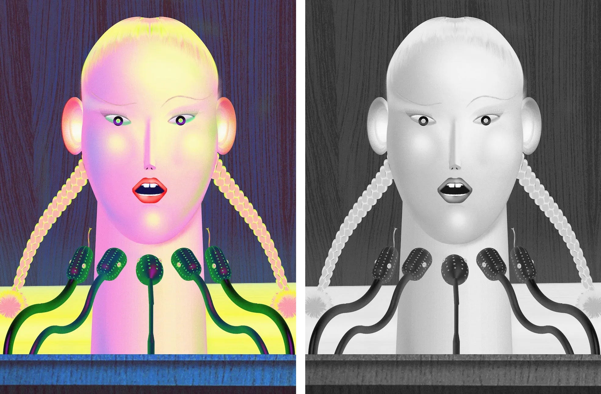
So fun, right?? When we understand the basics of value, it frees us from using the “right” colors, and we can start to experiment and play. Here’s another by Ohni Lisle.
The same is true for YOUR drawing practice. You can use colored pencil, paint, pastel, pens, you name it. Understanding the role of value in color frees us up to interpret and express the world and ourselves in new, vibrant, colorful ways.
Now let’s get the answer to that quiz, and try some colorful value experimenting ourselves:
